Henceforth
Brewery & Wine Bar
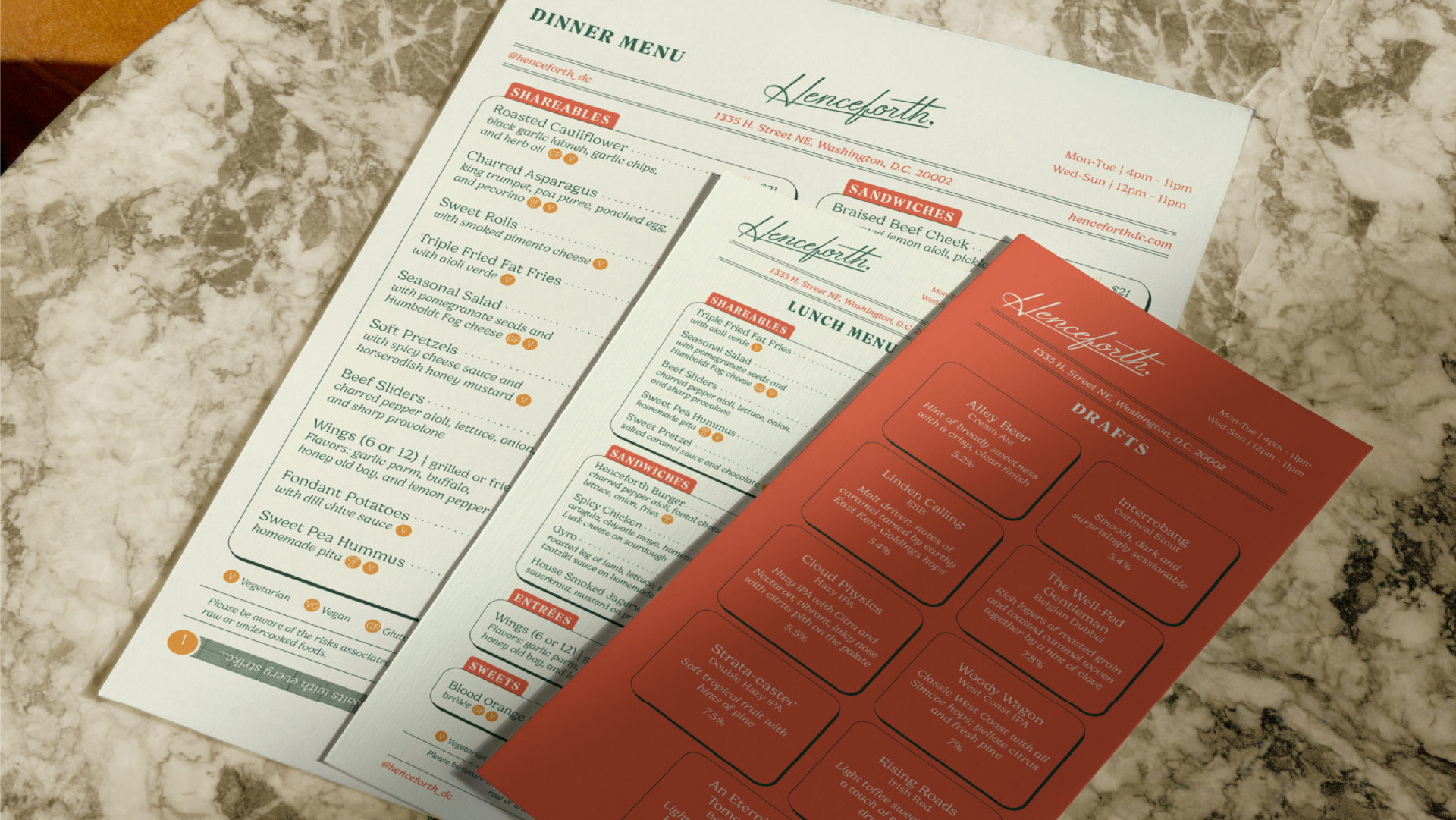
We partnered with this bold new concept to develop a custom-lettered wordmark rooted in mid-century modern style, with one powerful detail at its core: the comma. It’s more than punctuation — it’s a symbol of what comes next.
From concept to canvas, we loved bringing Henceforth’s story to life in DC. From scroll-stopping social graphics to a sleek, user-friendly website— and even hand-drawn portraits of each of the team members— our collaboration proves the power of print and digital working hand in hand.
From the brand name to the pen nib tucked into the visual identity, a literary theme threads through every element. Because Henceforth, isn’t just a place — it’s a declaration.
So, tell us — Henceforth, ___________?