4 Craft Beer Packaging Trends of 2016
As we reach the halfway point in the year, we’ve noticed several trends in upcoming breweries and packaging that have been launched in the beer market. Ranging from clean and geometric to a humanist touch with individually drawn lines, all these packages are gaining award-winning traction in design and beer forums.
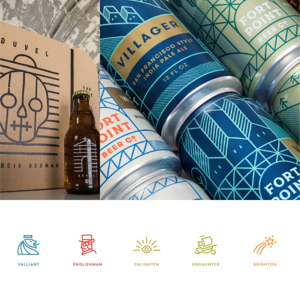
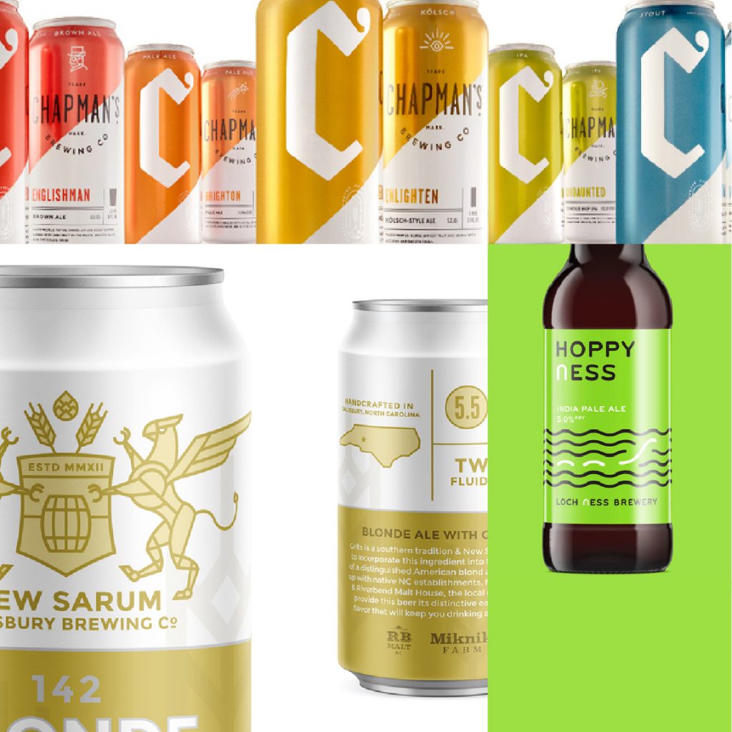
SIMPLE SWISS :
The Jane, Duvel (Toykyo, Jimmy Lee, SH19), Fort Point Beer Company (Manual), Chapman’s Brewing Co. (Cue), New Sarum Brewing (Big Bridge), Loch Ness Brewery (Thirst)
- Bright, often two tone color with white
- Smooth, consistent linework that doesn’t vary in width
- Geometric shapes combine to form figures
- Stroke of linework either is rounded on the ends or cleanly geometric
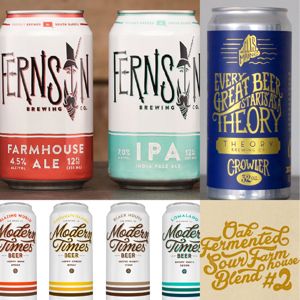
HAND-DRAWN TYPOGRAPHY :
Fernson Brewing Co. (CODO Design), Theory Brewing Co. (12 Line Studio), Modern Times (Helms Workshop, Simon Walker), Green Bench Brewing Co. (Craft Brands)
- Hand wrought script or serifs focus on the letterforms as the hero of the design
- Often have flourishes or linework surrounding the typography
- Texture often applied to make the design feel even more like there was a human touch
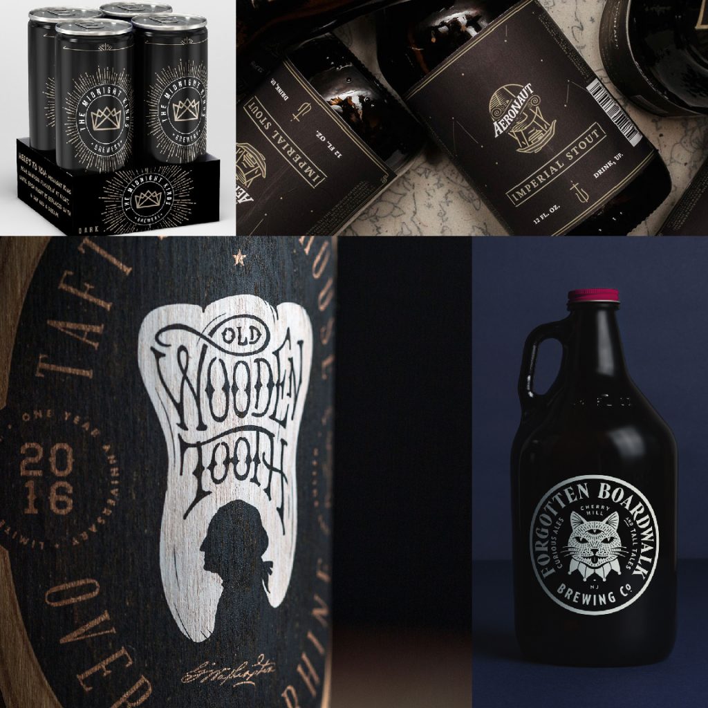
WHIMSY & GRIT :
The Kings of Midnight Brewery (Roberta Hall), Aeronaut Brewing Co. (Ethan Blouin, Evan Eagan), Taft’s Ale House (1 Trick Pony), Forgotten Boardwalk Brewing Co. (Perky Brothers)
- Black and Neutral Colors, Desaturated
- Playful, imaginative topics
- Clean linework
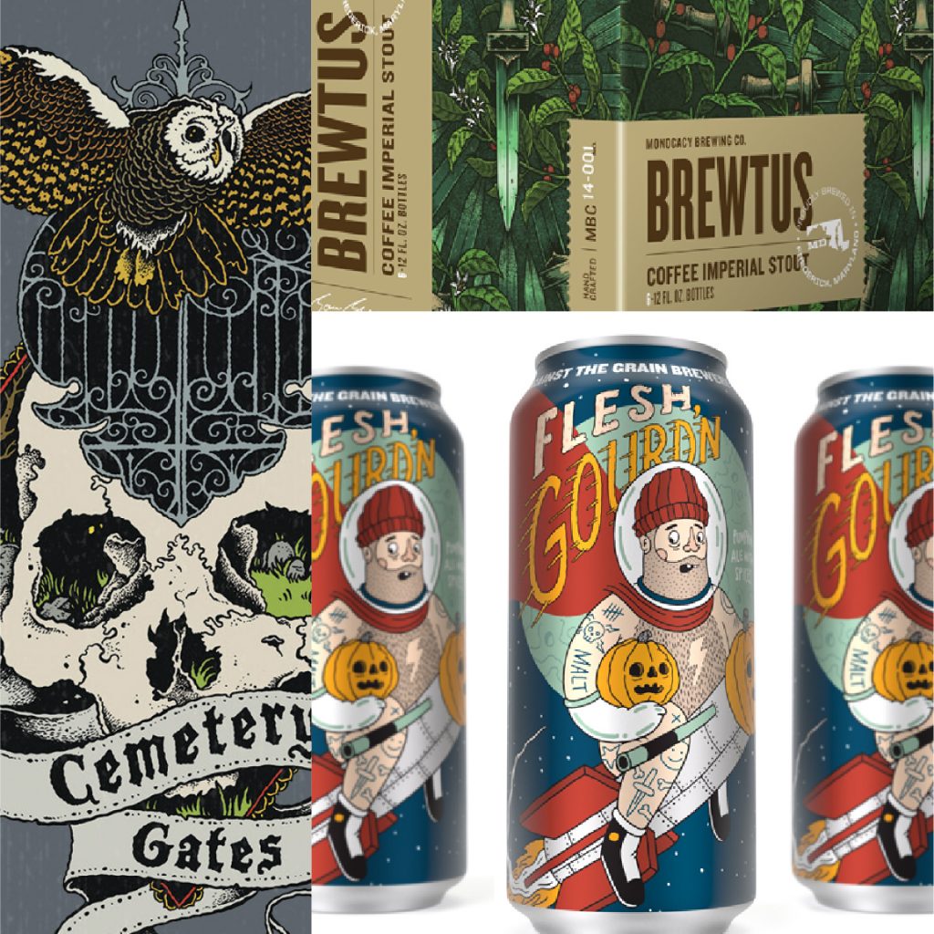
TRADITIONAL PEN & INK ILLUSTRATION :
The Burial (David Paul Seymour), Monocacy Brewing Co. (Tribe), Against the Grain (Robby Davis)
- Hand-drawn illustration inspired by gig posters, comics, and skate culture
- Fine linework and detail rendered in pen outlines, then colorized
- Stylized realism or contemporary rounded comic forms
Check out some of Watermark’s craft beer client work here:
