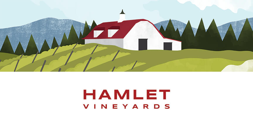
Hamlet Vineyards Brand Refresh
Hamlet Vineyards approached Watermark looking for brand cohesion across their line of wine labels.
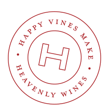
We began with the foundation of all brands, the logo design. We provided a slight update to their wordmark, refreshing the type with a modern sans serif that echoed the original font, for continued brand recognition.
The next step in achieving brand consistency was selecting a single paper stock for all classic-line varietals. A bright white was selected to update the brand from it’s previous off-white substrate, conveying a more modern, fresh aesthetic. We also consolidated all capsules to a single red, reflecting the brand’s primary color.
To differentiate between varietals, each label now includes a custom illustration reflecting the architecture, activities and fauna experienced at Hamlet Vineyards.
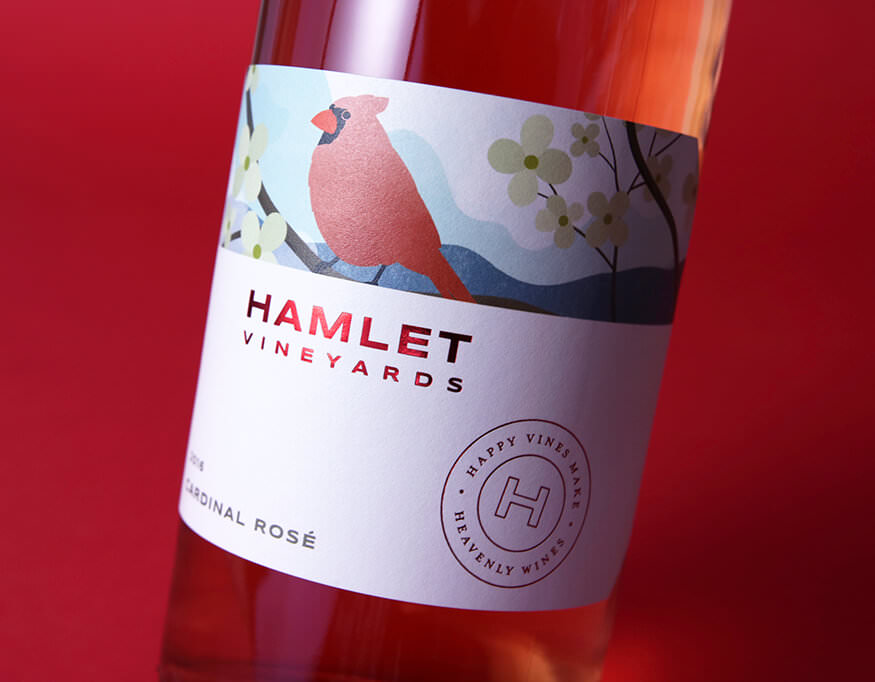
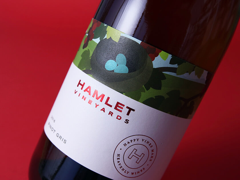
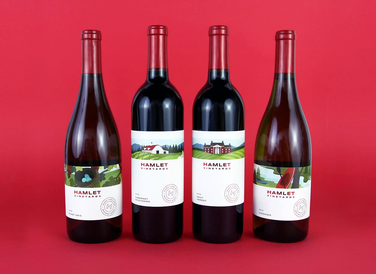
The owner’s infectious ‘joie de vive’ and the focus on an enjoyable and active experience at Hamlet, is communicated through the contemporary twist on the original illustration style. Since the project scope was a refresh, not a rebrand, we kept the illustration style similar to the original deconstructed approach. Located along the Smith River, you can pair your wine tasting with a kayak trip from the winery throughout the summer. From bubble bars to vineyard picnics, you will not leave without a smile on your face.
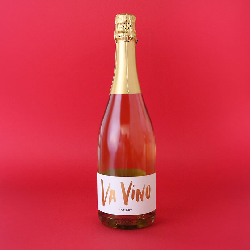
We built upon the expressive feeling of fun and celebration on Va Vino, the sparkling wine label design, through hand-lettered typography. This hand-type is then continued onto the back label, hand-lettering the brand statement, which can be seen on the back label across the entire line of wines.
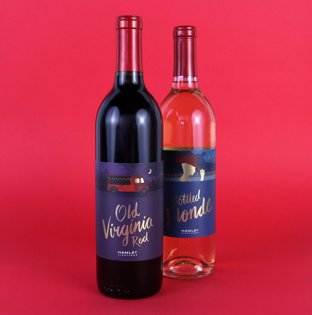
For the more accessible ‘picnic’ wines, we maintained a similar illustration style and label size, but added color to the label background and built upon the hand-lettering introduced through Va Vino, rendering the titles of the wine in hand-lettered gold type.
Hamlet’s wine truck, named Old Virginia, is featured on the table red. Virginia, the owner’s name and the location of the winery is another thread throughout Hamlet’s brand that can not be missed. A sense of place is expressed throughout their brand.
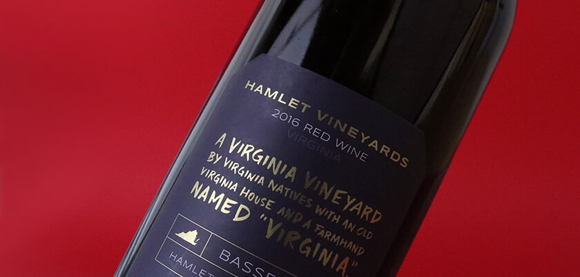
The brand statement was hand-lettered, and is now the primary feature on the back of all the labels, adding further consistency across the lines.
Once the wine label design was complete, we continued the brand refresh through outreach on social media, a website update, rack cards, signage and more to ensure that there was consistency across all platforms, and in all places that you would encounter the Hamlet brand.