Dogged Vine
The beauty the struggle can create
Dogged Vine came to us looking for a mark that reflects and celebrates the gnarly and rough conditions that are necessary to produce the sweetest moments in life.
This label's artwork explores the contrast between gnarled, dry older grape vines and lush foliage and other delicate moments, and how the two can coincide to tell the story of struggle and the joy that comes after.
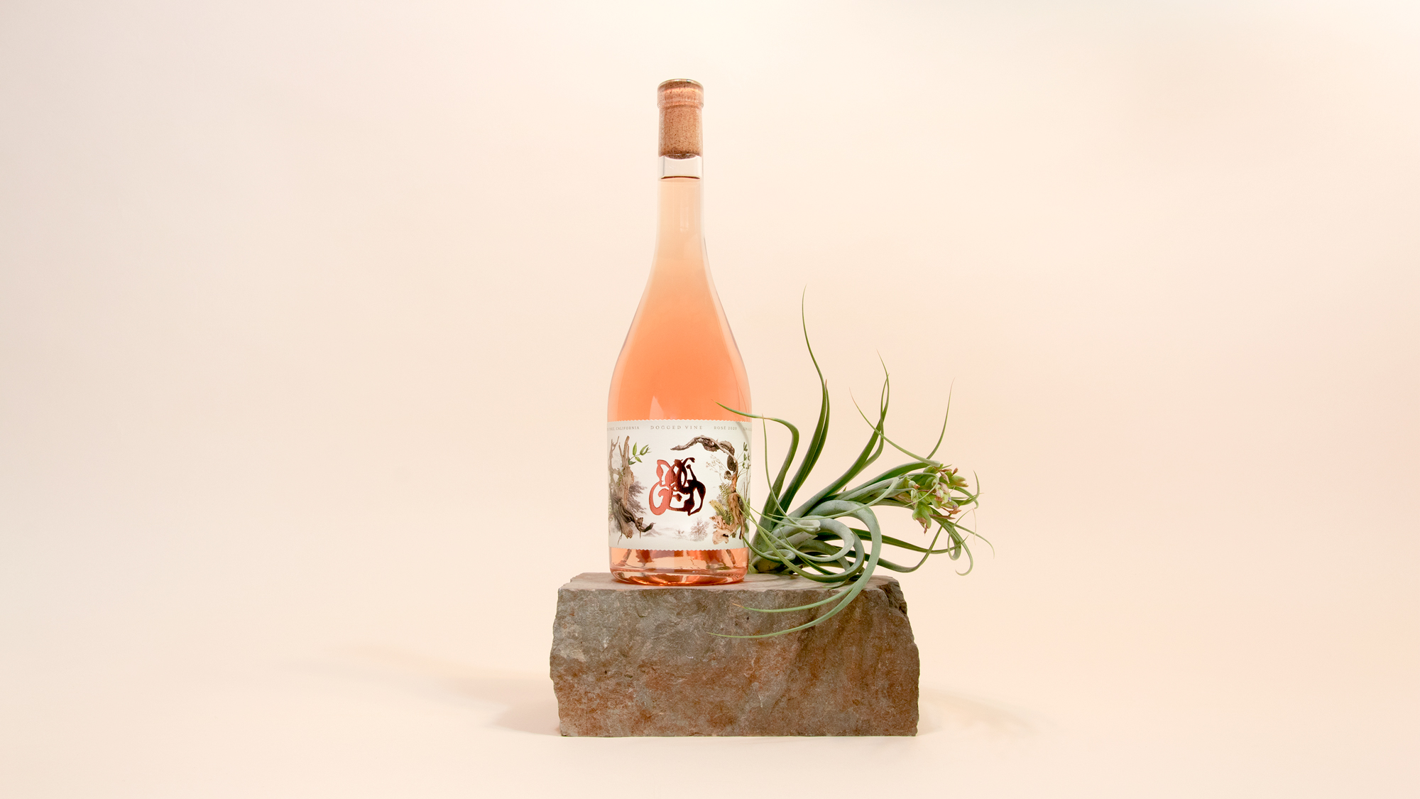
Up close, the embossed and foiled logo takes center stage, with Irregular letterforms that are strewn together to create a mark that is unique and art-like in its presence.
The prominent mark rests between a collage of branches and vines that evoke the dry California land contrasted with the rich lush foliage that grows out of it to create these wines. Other natural, whimsical moments are hidden within, from dragonfly wings to the chrysalis.
As you turn the bottle, the art evolves into a blind embossed moments to create the necessary white space without forfeiting detail, hinting at the beauty hidden beneath the struggle.