New Orleans Influenced
Simple Syrups
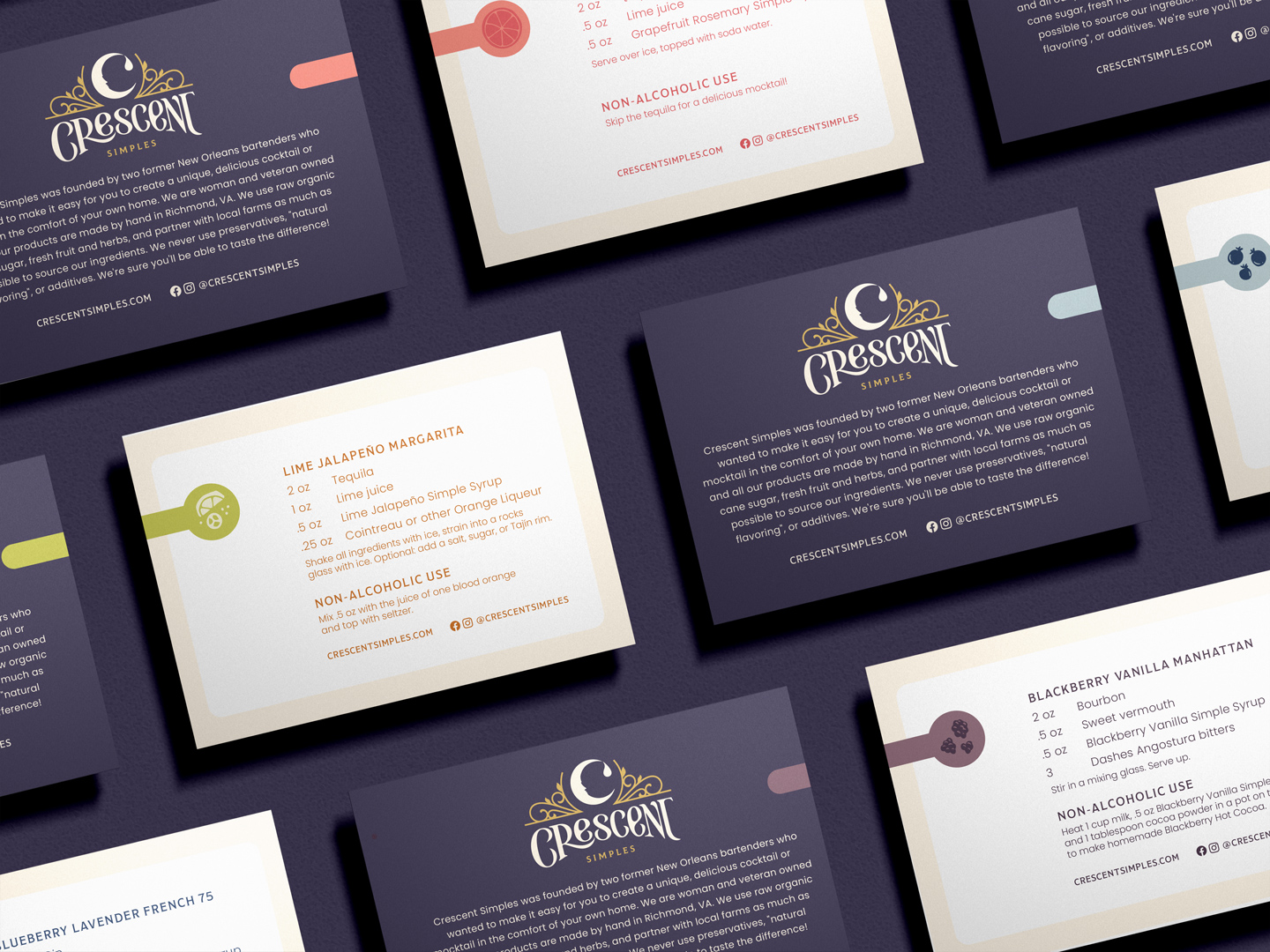
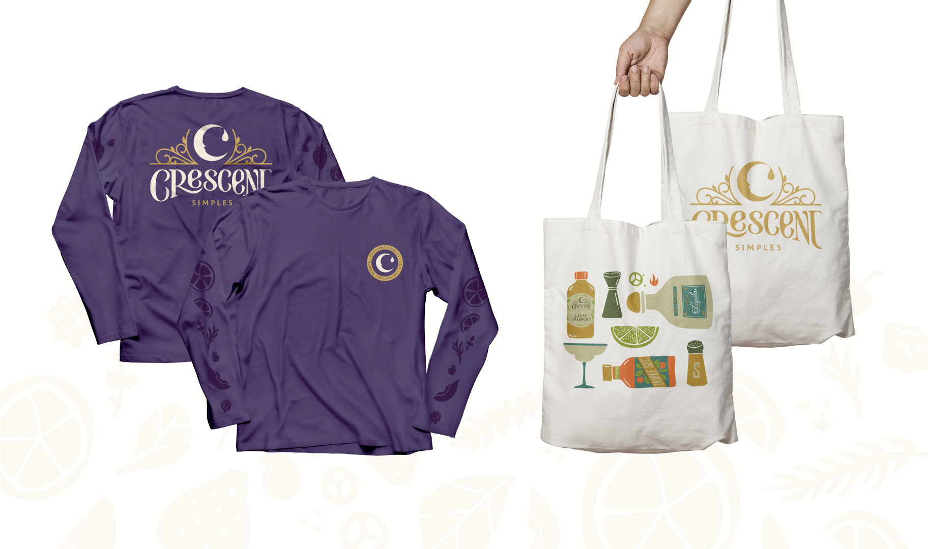
Crescent Simples, a New Orleans-born simple syrups company, came to Watermark to refresh their brand. Wanting their logo and packaging to match the quality of their products, they had a big vision for regional & national growth.
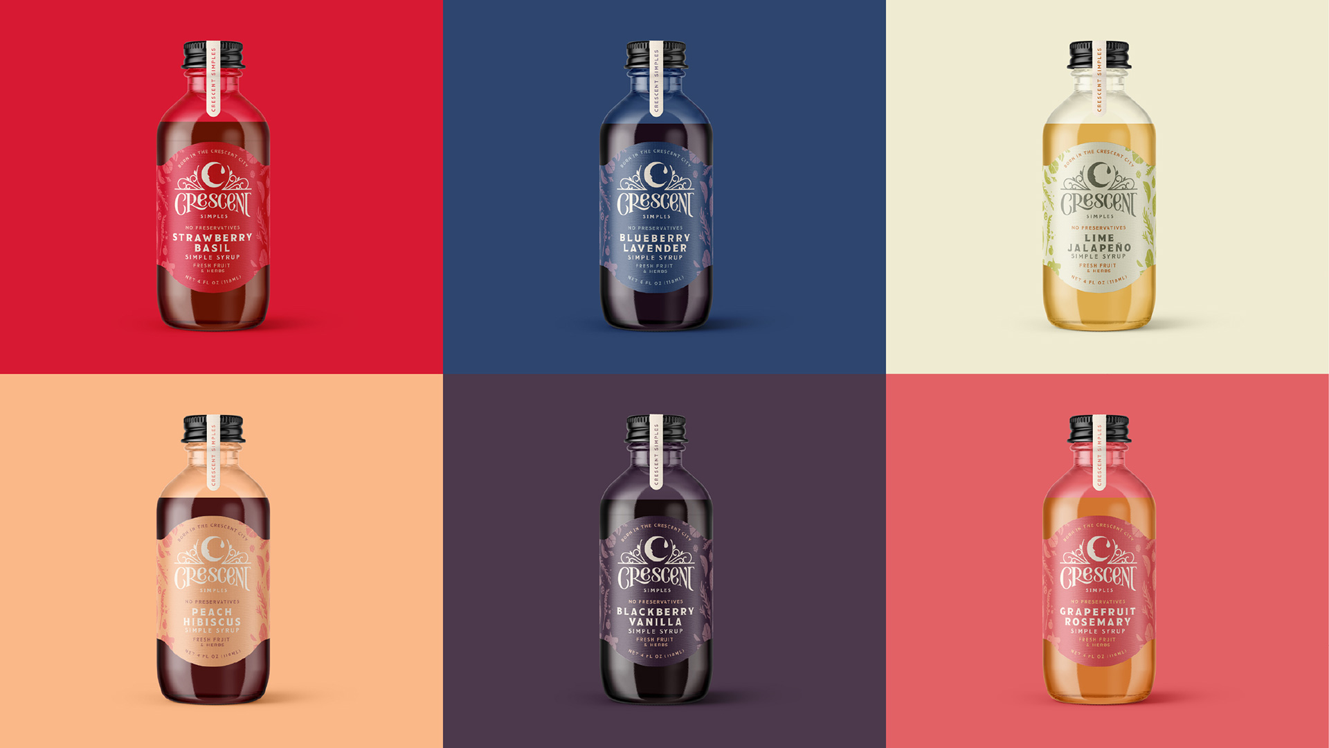
Their logo is packed with hand-lettered moments and meaningful imagery that tell the story of their vibrant beginnings in the Crescent City. Illustrative moments evoke the architectural ironwork seen a long Bourbon Street, flanking the crescent moon, a symbol seen across the city, visualizing it’s namesake and a small droplet detail to indicate these flavor-forward simple syrups.
Brand continuity from the original packaging was achieved through updated illustrative patterning, continuing to convey the fresh ingredients used within the products through new stylized fruit drawings across the background of the simple syrup labels. Each flavor is denoted through vibrant color palettes that relate to the ingredients. The color system was an important upgrade, providing an effective identifier for the individual products. The rebrand resulted in immediate accounts & orders that had been previously unattainable.