Schuyler Greens Package Design
Schuyler Greens focuses on growing only the finest quality microgreens, salad mixes, lettuce & herbs hydroponically in a high tech, climate controlled greenhouse. Schuyler came to Watermark to elevate and redefine their packaging to better convey the quality and care that each container delivers, mixed with their unique growth process.
Beginning our exploration, we kept multiple goals in mind:
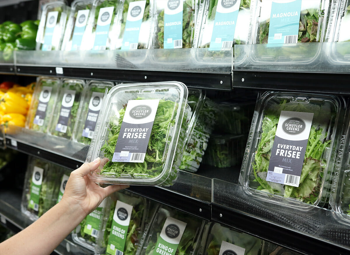
- Develop a system that would easily display which greens consumers are buying. Red Butterhead? Green Butterhead? We needed to ensure that each package quickly conveyed what greens were within.
- Translate the fresh and artisanal nature of Schuyler produce.
- Develop a package that would work in unison and support the existing Schuyler Greens logo.
After researching the client and the shelves the product would be competing on, we developed the label series below.
Each label design is distinct in color, and can be easily distinguished from other packages on shelf.
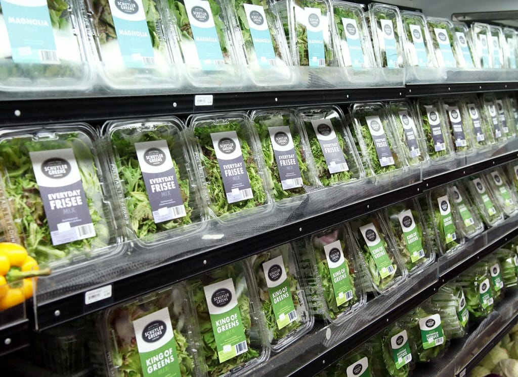
The system offers tremendous flexibility, both in size and color, and isn’t hindered by the addition of new greens being added.
Each label design features a patterned illustration of fresh greens. The illustrations played a large role in our solution for visually displaying the organic and natural origins of the produce, which could be in question by those unfamiliar with this technology. The labels, while modern, still feel approachable and fresh.
Throughout the process we reflected back on the guidelines established, keeping the current aesthetics and logo in mind. While the label design featured new brand fonts and colors, they correlate closely with the aesthetics and fonts of the Schuyler logo.