5 Trends in Craft Beverage & Packaging for 2019
With 2018 coming to a close, this is the perfect time to forecast how different 2019 will be on the shelf for the craft beverage and packaging industry.
1. Vivid Color
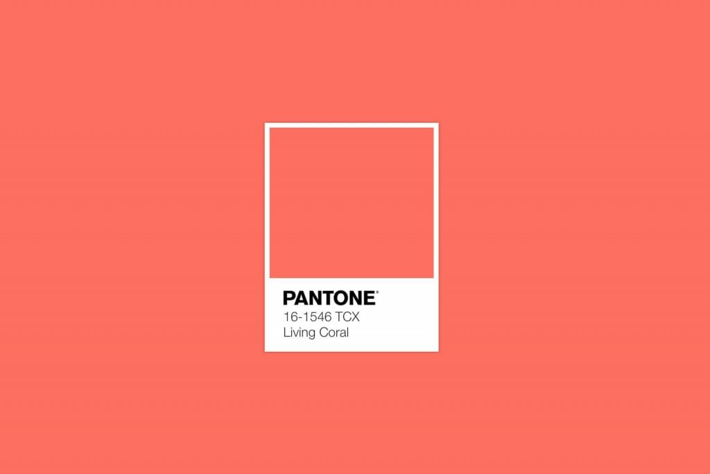
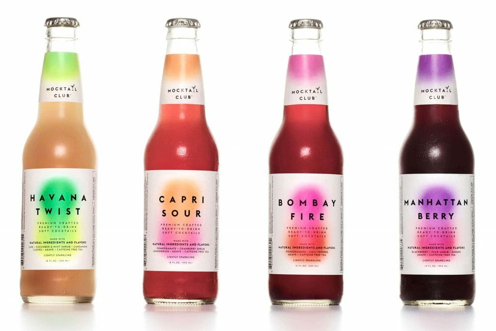
Every year Pantone chooses a color of the year. For 2019, pantone chose coral. So what does this tell us about packaging trends? No, we don’t believe all labels will be coral colored. However, we can deduce that there is a cultural desire for vivid, saturated colors. This could mean using large areas of flat color or bright color transitions like gradients.
2. Interactive Packages
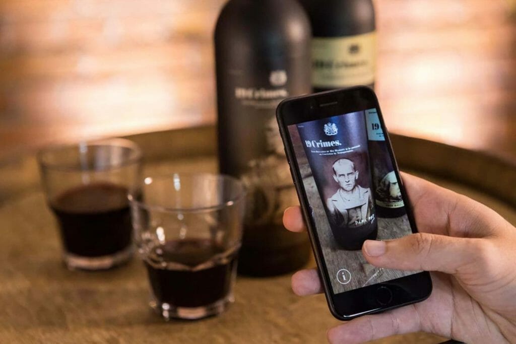
Augmented Reality is now happening in packaging. If you’ve never seen an augmented label design, just imagine your label’s imagery coming to life. Our favorite part of this technology is the social aspect of it. Any brand’s social media presence is increasingly becoming more and more important. This interactive element in packaging is the perfect ‘instagram-worthy’ moment that could really put your brand on the map. Our only advice: Make sure the design of the package is eye-catching and effective on it’s own and let any interactive element be the cherry on top.
3. New Printing Processes
As designers, printers, bottlers and creatives continue to work together, they will inevitably push boundaries resulting in new possibilities for packaging. We are referencing new and interesting diecuts, paper stocks made from unique materials, bottle shapes, foil colors and more. This will continue in 2019. If you want your package to stand out on shelf, we highly recommend partnering with a design firm who has strong connections with tangential companies within the industry.
4. Color Foil
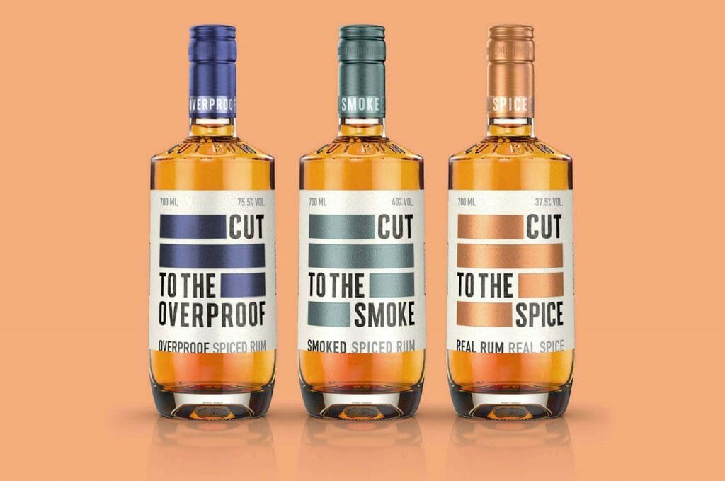
We’ve seen gold, silver and copper foil used throughout the packaging industry to convey elegance and sophistication. But there are a plethora of other foil colors at our disposal that can communicate a range of other emotions and messages. We suspect it’s time for some other colors to shine!
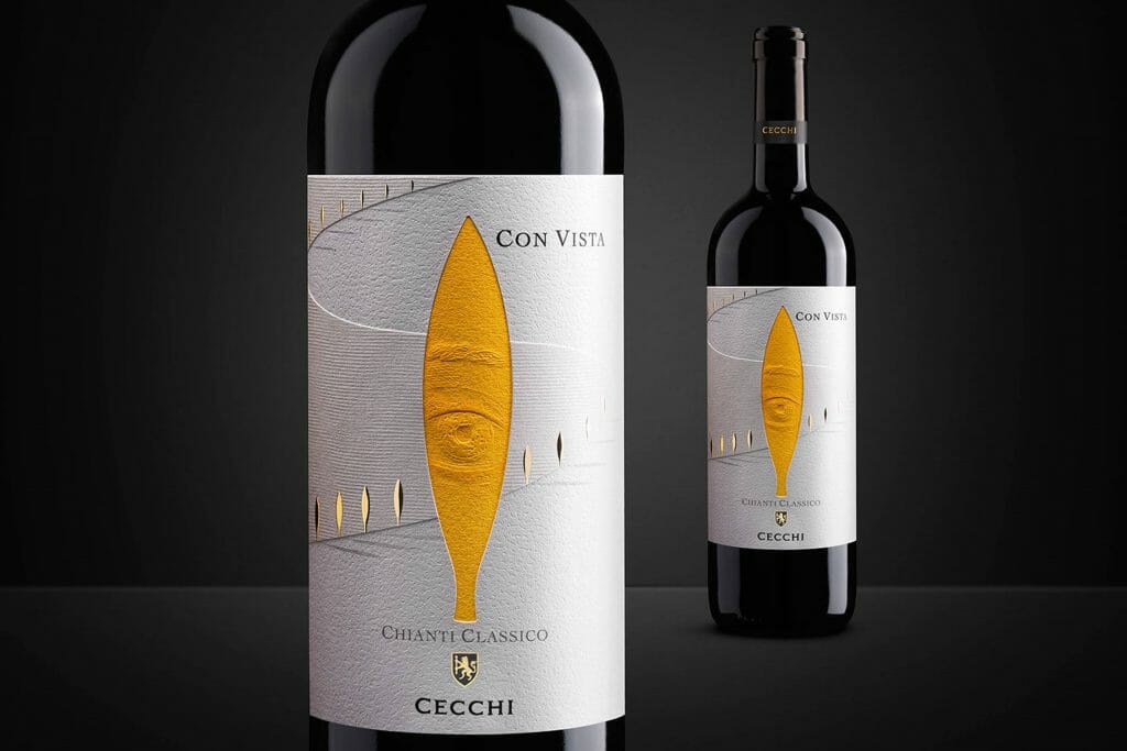
5. Unique Typography
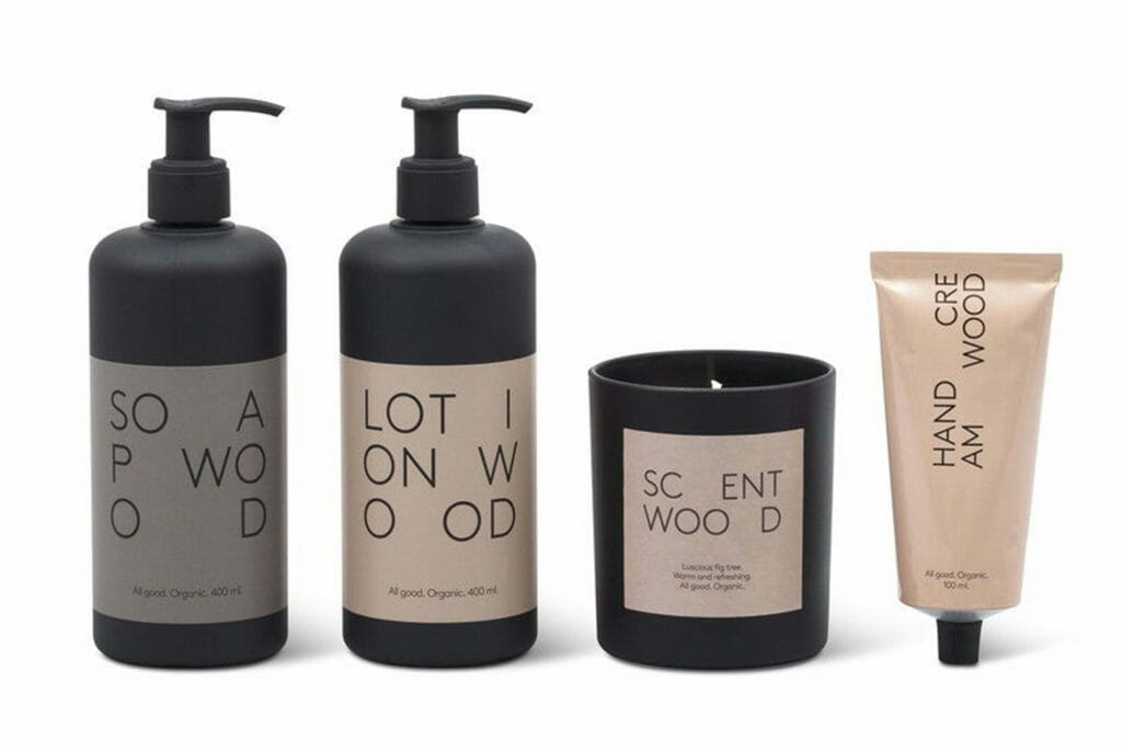
Minimal package design, as shown above, has been prevalent for a few years in the packaging category. But a minimal design does not mean the typography has be simple or expected. In fact, we predict that with the availability of so many wonderful typefaces now, it will be crucial that your packaging’s typography be unique in it’s form and it’s layout. This can come in the form of hand-lettering, or choosing the perfect sans serif and using it in an unexpected way.