The Current Renaissance in Beer Label Design
Alongside the rising wave of craft breweries across the United States, competition in retail has caused a dramatic shift toward investing in innovative packaging design for the beer label industry. Some ramifications include the historically significant Milton Glaser bluntly critiquing modern label design last year, but from the beer industry’s standpoint, embracing renowned designers and talented illustrators has become a new radical way to diversify the beer shelf. Contrary to Glaser’s thesis, modern design in the beer market is anything but rudimentary. The core philosophies of tenacity, innovation, and handmade products within the American beer market pairs organically with the adroit craftsmanship of modern illustrators. As distribution spreads across the United States, the shelves of the beer retail market are uniquely democratic- they have become miniature showcases of vanguard talent in the design industry that are curated next to local artisans’ work. The recent surge of high quality label design has humble origins, and as printing techniques continue to advance and become more cross-platform with the wine and liquor industries, avant-garde packaging will become a key influence on how customers perceive a brand, and ultimately, purchase the product.
THE HISTORY OF LABELING
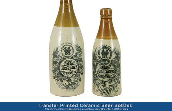
Bottled beer was relatively unknown until the advent of pasteurization in the late 1800’s, as almost all beer was distributed in kegs in order to avoid spoilage. Bottles that were used were often reused by companies for several products and embossed with a seal or coat of arms with the company’s name. Ceramic stoneware bottles were common in the United States, and until the invention of the crown cap (also known as the crown cork or seal), were corked or porcelain swing-top bottles. These seals proved that the beer was authentically crafted by the brewery, and were the prototypes for logo development and branding, as animals or objects became commonplace symbols to differentiate products from one another. In Europe, with the repeal on the Duty of Glass in 1834, beer labels became more prominent in the market. The transition of embossed bottles to paper labels evolved in tandem with the growing railway systems of America and Europe, as well as the Industrial Revolution’s influence on the ability to produce mass-marketed beer.
As the scale of beer production grew, the need for stopper labels rose in popularity, as a broken seal showed that the carbonation levels in the cork had compromised the beer within during storage. Stopper labels were also a sign of proof that the beer was genuinely produced by the brewery, as counterfeits rose in the marketplace. Additionally, labels were much more inexpensive than embossed bottles, and could be ordered at larger quantities for less money. Classic label styles were based on the traditional circular or oval shape with a band across, with simple, bold text labelling the type of beer in brightly rendered colors, usually in a duotone process. Conservative markets and advertising theory, especially in Britain, would often preach restricting the labelling process to a singular shape or layout for the label with only the name of the style of beer changing in order to gain brand recognition. This style of label was also much cheaper to print, as production only had to recreate a single portion of the plate for the new edited layer as opposed to creating multiple plates for illustrations. The beer market maintained a steady, traditional approach to labeling in the United States until only recently, as breweries outside of the major three during the lion’s share of the 20th century were few and far between.
A DAY IN THE SHELF LIFE
On an exponential scale, labeling has become incredibly diverse over the past ten years, and has quickly superseded other avenues in the design industry because of the quick turnaround for new labels, advances in digital printing, and the assortment of beer styles that are encouraged to be branded uniquely from one another. By the nature of the brewing industry and its embrace of illustrative packaging, beer consumers are bombarded with imagery that constantly shifts and changes as new styles are rapidly produced each season. With this astronomical rise, sales have become increasingly competitive, and packaging has become an extraordinarily influential aspect of whether a consumer purchases a specific beer.
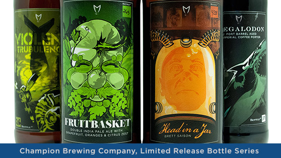
As a result, many breweries have turned to renowned illustrators to revamp their labels in a way that is different from the pack. The market has allowed for a variety of approaches to design- some brands favor intricate, whimsical illustrations (TBD Advertising, Illustrators Joe Wilson, Jon Contino and Kim Sielbeck, 21st Amendment Brewery), while others are streamlined minimalist designs (Martin Justesen, Evil Twin Brewing). Some of our most recent work for Champion Brewing Company features a limited release bottle series, each hand-illustrated to reflect a detailed concept for each beer (more information on our process can be found here).
By investing in even a slight refresh, a brand identity can become more modern and relevant to their consumer without diverging outside of their core brand. Click here to see examples of successful refreshes. Whether it’s a complete refresh (Joe Duffy’s 2012 renovation of Ommegang Brewery; Hatch Design and Leah Giberson’s retooling of New Belgium this past year; MiresBall’s update for Ballast Point) or a spotlight series of seasonal and higher tier bottles within the current brand (Ken Taylor’s Ruthless Rye, Narwhal and Flipside with Sierra Nevada; The Widmer Brothers screen printed 30 Beers for 30 Years Project) modern illustration can be a welcome addition to an established brand. Today’s label design has returned to the artisanal style of hand-drawn illustration, while accommodating for mass production and the ever-changing variety of design on the shelf.
BY THE NUMBERS
64% of consumers try a new product because of the package design, while 41% of consumers purchase a product again because of the packaging. Even long-standing, popular companies that shift their packaging have seen increased sales despite consumers having already experienced their product. Although MillerCoors’ sales were low last year, “the Miller Lite retro can bumped sales by nearly 5 percent. MillerCoors didn’t change its beer; it just changed the can it came in.”1
Affinnova’s researchers “found that 36% of customers selected their purchase based on package design, which accounts for a larger share than traditional marketing strategies such as television ads and endorsements.”
The beer packaging market has made huge strides in the technology involved to print labels and produce screen prints, UV spot gloss, diecuts, and foils. High-end boxes for single bottles are becoming more prominent, as well as bottle wraps and embossments. The breakneck pace of beer packaging will only increase, and the more that breweries invest in advanced printing techniques and innovative illustration, the more they will differentiate themselves on the shelf.
Find out more about our brewery brands and package design by visiting: