Penelope Bourbon
Brand & Package Design Refresh
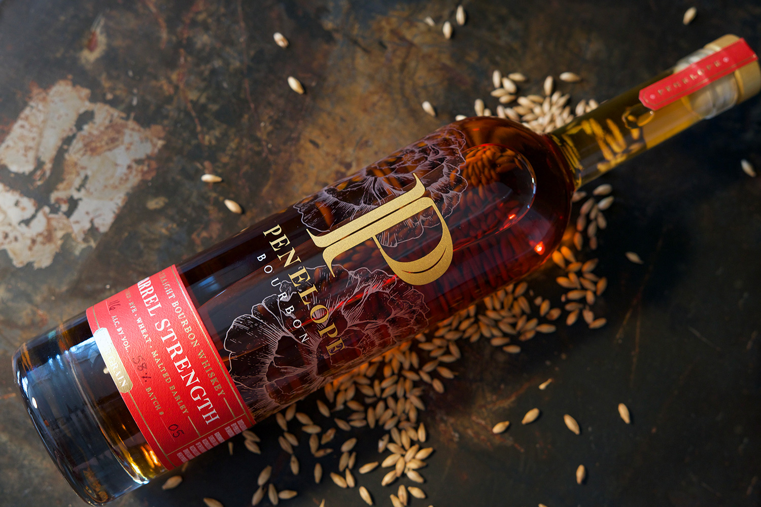
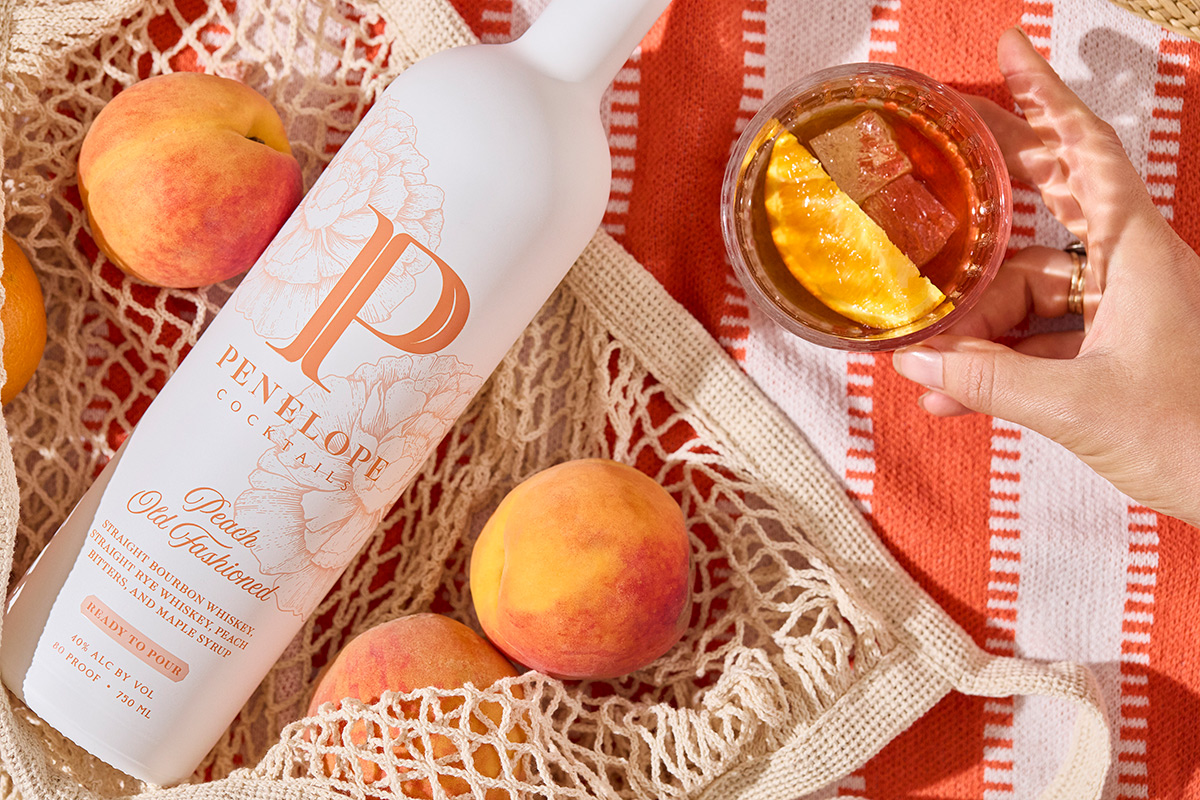
We specialize in refreshing brands that already have a strong reputation and following, like Penelope Bourbon. Beginning with the logo, we retained brand equity by keeping the 'P' in the logo, but customized and elevated it with additional detailing and refined typography beneath. Next, we refreshed their peony imagery, evolving from a photographic background to a custom, hand-drawn illustration that can perform with more versatility, while also elevating the overall brand with delicate linework.
The package design process evolved from an update of the four grain label into their premier Barrel Strength bottle, allowing full visibility of this beautiful liquid with a barely-there etching of the peonies and a bikini label around the bottom. Consistency is maintained across the product line-up through logo placement and other design choices.