Honey Glow
Honey Glow is an eco-conscious business located in Maryland that offers natural, earth friendly products ranging from lotions, skin salves, lip balms, and candles. Many of their products are based on natural ingredients from their own honeybees! They approached Watermark in late 2012, hoping for a refreshed brand, starting with the logo and label design! We ecstatically, said yes.
OUR STEPS FOR A REFRESH:
1. Understanding who they are! This includes understanding what their sacred brand elements are. In this case, we found that the elements that should remain consistent through the redesign were: The colors blue and gold, & nature-inspired illustrations. We also spent time learning about their current and desired market. Honey Glow wanted to keep it’s approachable, all-natural grooviness, but sought to add some sophistication & elegance: a direct correlation with their high-quality products.
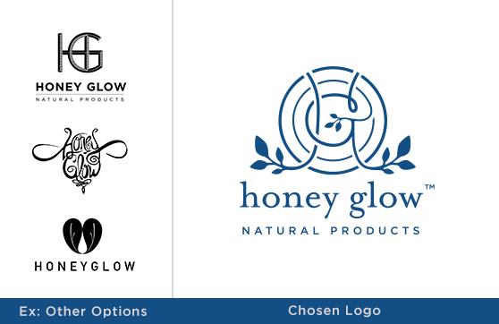
2. Start with the logo. Because a company’s logo appears on virtually EVERYTHING, we started to explore the Honey Glow redesign first with the logo. We presented several different directions ranging from slightly more formal & refined, to edgy & hand-wrought. After refinements, Honey Glow settled on their new logo: A bee-hive-like monogram featuring the “H”, “G”, and leafy flourishes.
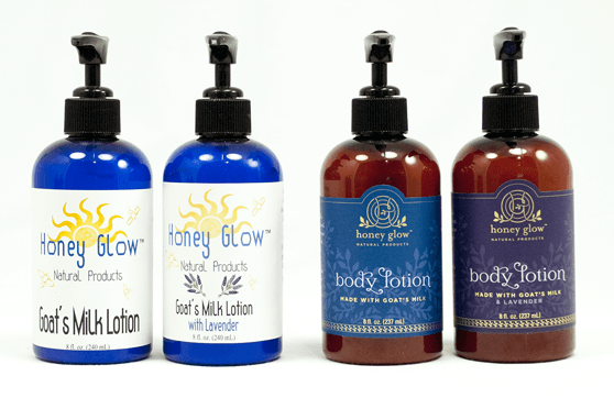
3. Label Design & Graphic Elements. A logo is a great starting point for a brand, but it’s not until after a project like a label, business card or website is completed that you can see who a brand really is! Honey Glow is a perfect example of this. After the logo was finished, we started to develop the new label design for the Body Lotion (made with Goat’s Milk). During this process we explored color palettes, illustrations, patterns, and typefaces that would compliment the new logo. Every inch of the the final design was carefully crafted and considered (from a custom UPC code, to a rounded die cut that emphasized the curved logo). 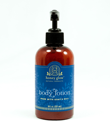
4. Consider the paper, substrate/bottle. When working within the packaging industry, there are a lot of choices and design elements to consider. In this case, for the Lotions, we could spec/suggest specific papers, foils, bottle colors, plastic vs glass, etc. Because we kept the sacred blue color on the lotion labels, we felt confident and comfortable suggesting a rich dark Amber colored bottle (which better achieves the original goal of appearing sophisticated & elegant).
5. Be consistent (on future projects) but allow the brand to grow! We’re looking forward to continue to develop the Honey Glow brand by creating future packaging, labels, collateral etc. that coincides with the new look & feel! Stay tuned!
Also, we thank the honeybees and wish them another safe year!