Case Study :: Thistlerock Mead Co.
Summary
This case study walks through Watermark Design's brand development process from research to strategy, brand identity & logo design, followed by bottle selection, package concepts, and finalization as well as the eventual development of brand outreach materials like tasting room signage, honey packaging, truck wraps, merchandise design, and more for Thistlerock Mead Co.
The Ask
Thistlerock Mead Co. came to Watermark looking for a partner on brand development for their new meadery. There were three existing brand pillars: people, planet, and pollinators. They hoped that through education, sustainability practices, and creating a place for people to connect, Thistlerock would become more than just the first net-zero meadery in the US. Crafting a quality product that funds their mission is only a part of what they do, but to bring it to market, they needed a brand that matched their ambitious goals and dreams.
Why Mead
The founders of Thistlerock not only embody these values, but their lineage also roots in Scotland and Ireland, a land rich in history, storytelling, and respect for the natural world. One of the oldest fermented beverages, mead has a direct link to the environment, with its key ingredient being honey produced by one of the most well-known pollinators, bees. Together the two provided an obvious direction and a meadery was born.
Bringing the Story to Life
This foundation provided a deep well of inspiration as the starting point for our research. Historical symbols, the systems of nature, the importance of threes, and mankind’s tradition of using storytelling as education and preserving lineage. Along with the respected tradition behind their product and core values, they asked us to bring a modern flair to engage with today’s market. From this, a majority of ideas revolved around the visuals of the name Thistlerock, elements of three, nature, and bold forms.
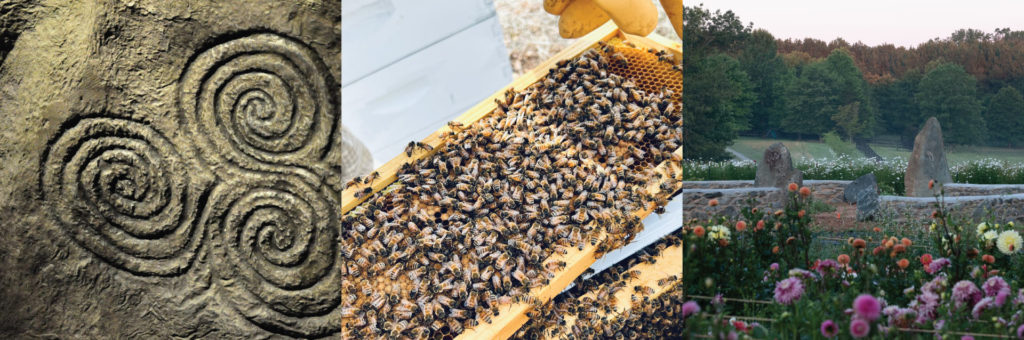
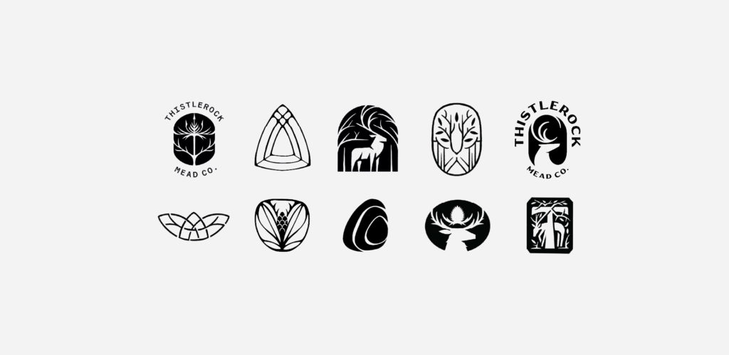
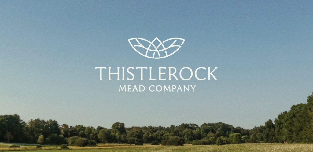
The final logo builds on a grid system of three overlapping circles inspired by the ancient triskelion symbol. A symbol of motion and the cycle of life, the triskelion naturally embodies many of Thistlerock’s core values — making its closely related grid system the ideal backbone for the logo mark, a discovery that felt like a truly serendipitous moment for the brand.
From this foundation we developed additional lockups, icons, and patterns.

The Packaging
The Bottle
Before design could begin, we needed to identity a bottle that fit the mission. From the beginning, sustainability has been at the forefront of Thistlerock’s values. This guided the decision to choose a sustainably sourced & created bottle.
The Wildly Crafted Oroshi bottle is made from 100% post-consumer recycled (PCR) glass, and alongside its unique finish and shape, made it an obvious choice.
Continuing the Journey
Central to our approach was deepening the lore of Thistlerock through layered storytelling and rich imagery often found in ancient tapestries. We crafted whimsical, hidden moments within the label to take the consumer on a journey, one that reveals the multifaceted values of the brand and can be seen and touched in real life, upon visiting their tasting room.
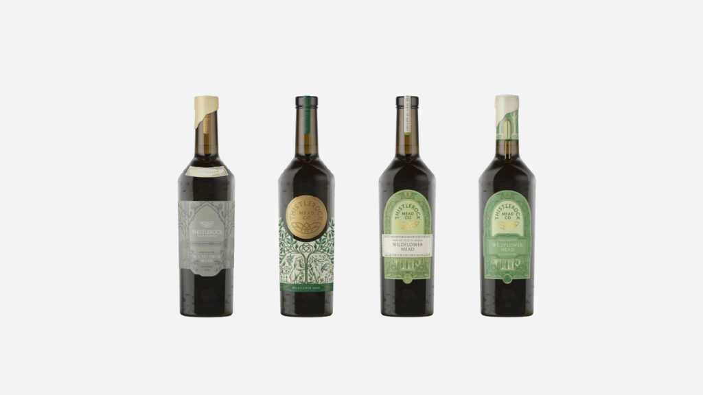
The final selection centered the logo in a medallion shape consistent across all skus, while bold color changes easily indicate the flavor profile across the line.
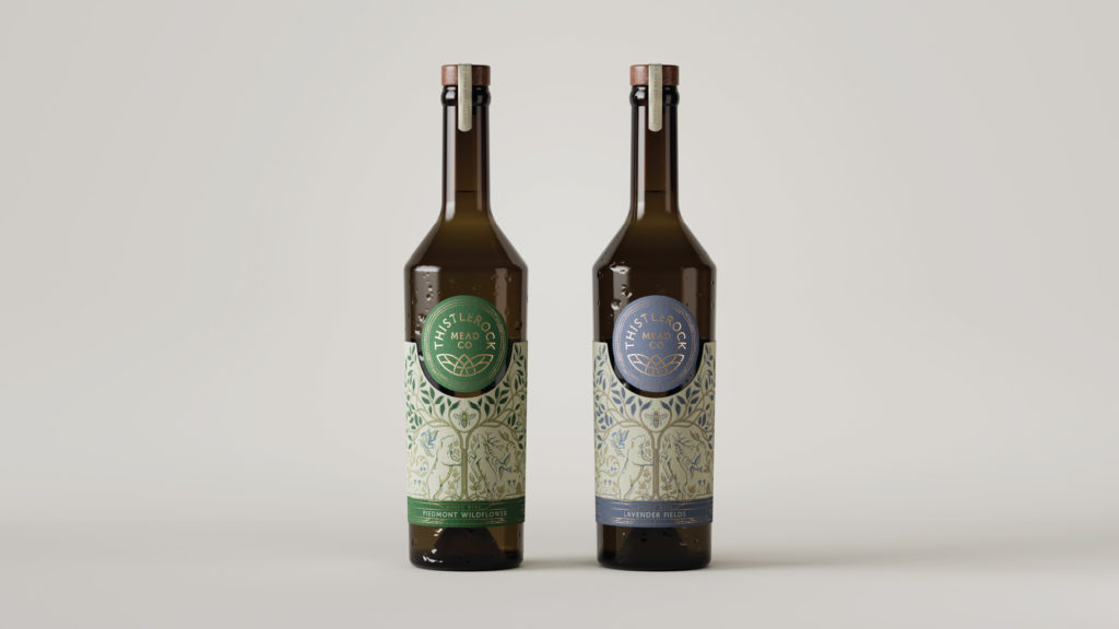
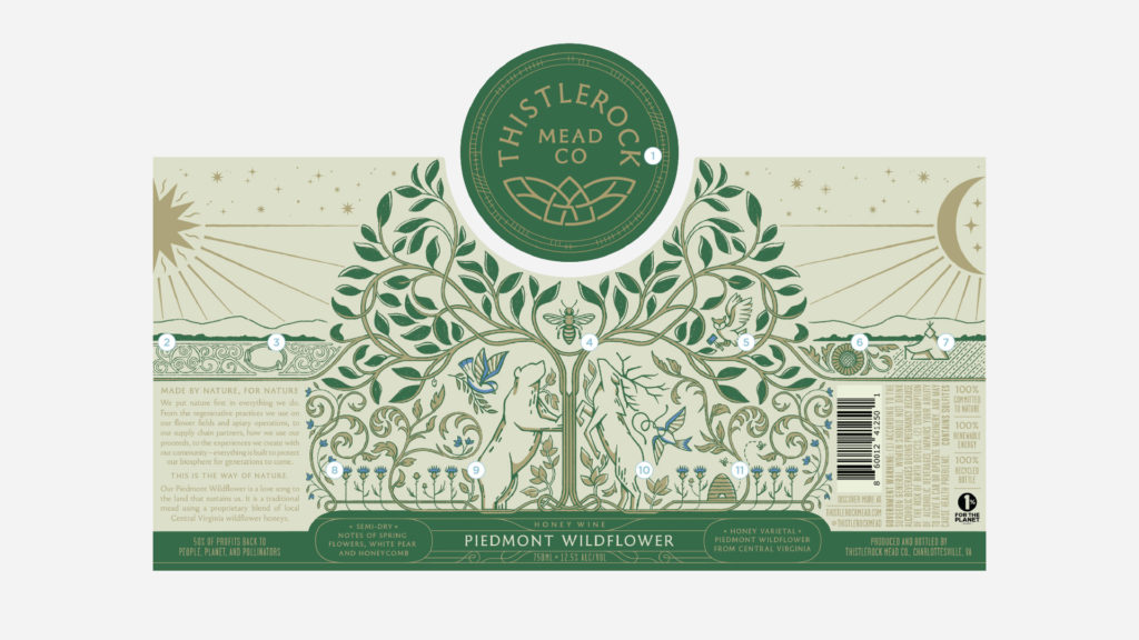
1. ‘The Way of Nature’ in ogham encircling the logo 2. A hidden triskelion 3. The stone circle found on the property 4. The honeybee, representing the pollinators who support the ecosystem 5. An owl with a hammer, representing their desire to build with wisdom 6. A sunflower, tying in the flower farm on the property and representing Thistlerock’s commitment to refugee communities 7. A Scandinavian teepee, similar to the one found on the property 8. Thistles, a namesake and native plant of Scotland and Ireland 9. A bear, an animal found in Central Virginia and one of the many protectors of the forest 10. A white stag, a rare sight in the forests surrounding Thistlerock 11. A skep, a historic hive used to house bees and harvest honey
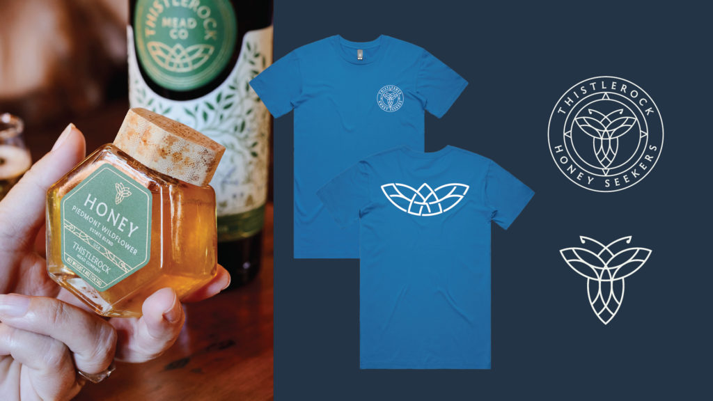
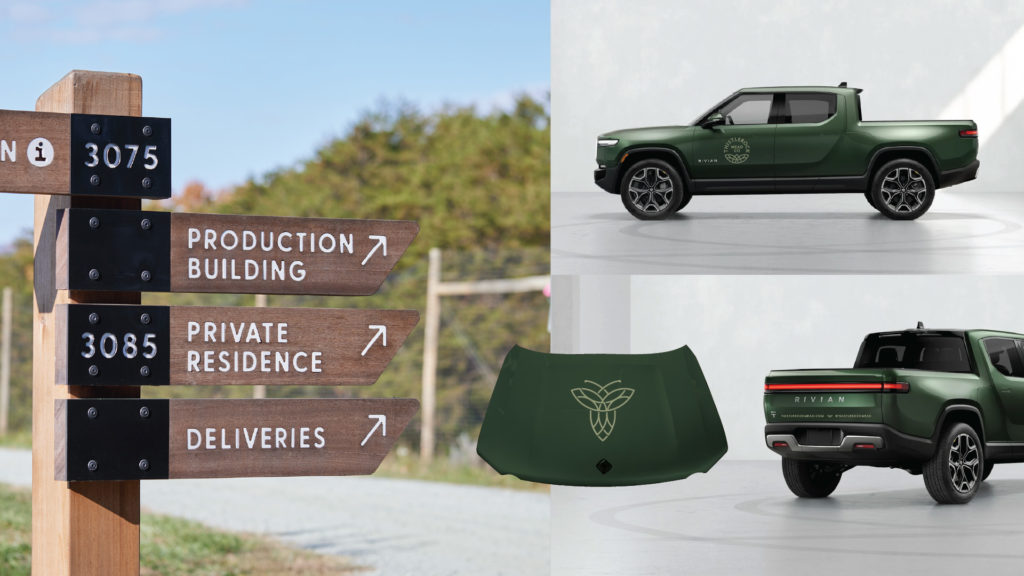
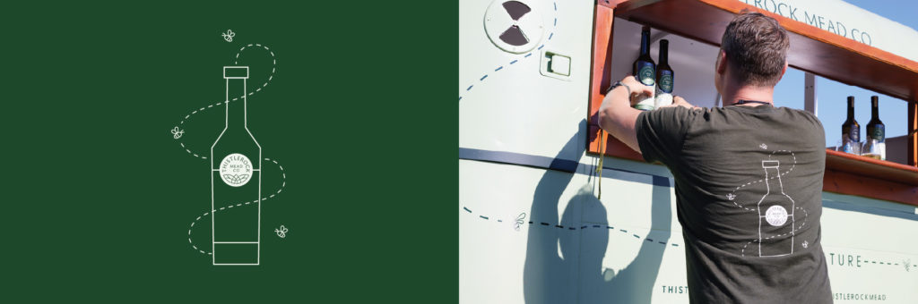
The core brand identity built a strong foundation for future products and new segments of the brand, including a honey line and a members’ club, the Honey Seekers. We partnered with Thistlerock to consistently execute the brand across the tasting room, signage, truck wraps, a mobile tasting bar design, merchandise, marketing materials, ad design, property maps and more.