2019 Year in Review
Just a few of our favorites from 2019!
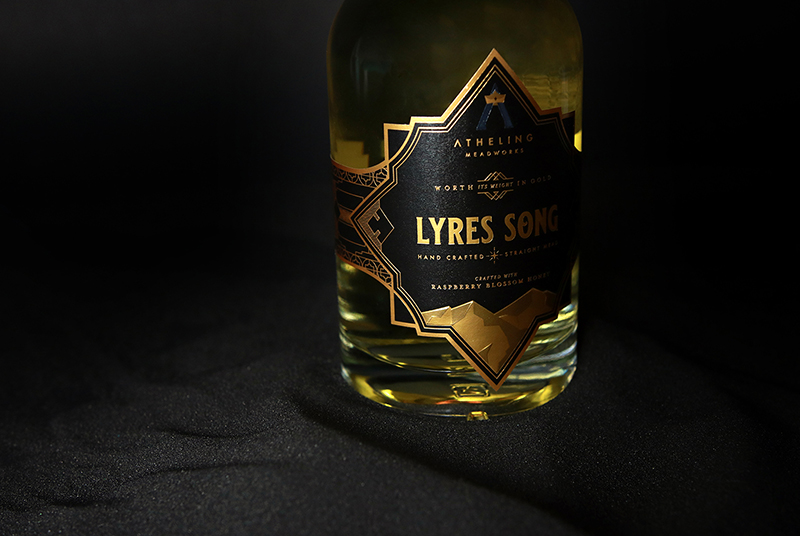
Atheling Meadworks
Branding, Packaging, Print & Online Collateral
Atheling Meadworks rekindles magic from ancient Anglo Saxon origins, delivering the finest handcrafted mead. The logo builds on the brand story, featuring a star inside the monogram, for the ‘star city’ in which it is produced. Each label features details reminiscent of Anglo Saxon craftsmanship, printed on a tactile stock with mountains rising off the bottle.
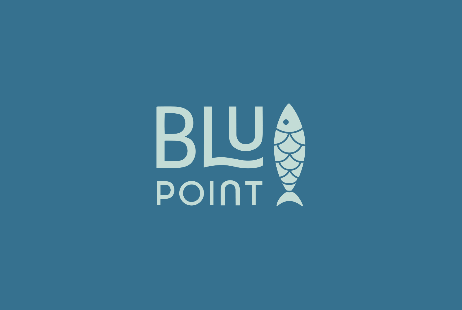
BLU Point Seafood Restaurant
Brand Identity/Logo Design
Successful restauranters, the Goodes, wanted to add a local option for foodies who wanted quality seafood in a fun & approachable atmosphere. From the flexible logo design to exterior signage, we wanted to draw in visitors through lively, legible and clean graphics. A school of fish swim across their front window, directing you toward the main entrance.
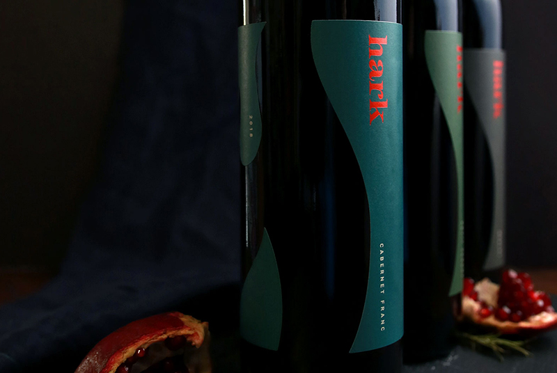
Hark Vineyards
Branding, Package Design
Wanting to build a place that was approachable and welcoming, inviting you sit a while with some great wine by their outdoor fire places, the Harks have focused on a space designed to highlight the mountain vistas, vineyards and bring the outdoors in. Watermark designed a brand celebrating these goals, choosing contemporary typography that would stand out, while also feeling friendly. The negative space that the label breaks create reflect the logo’s image mark. Custom capsules keep a wide range of wines cohesive through a neutral palette and a pop of burnt orange, continuing to evoke the physical location and brand goals through the identity & package design.
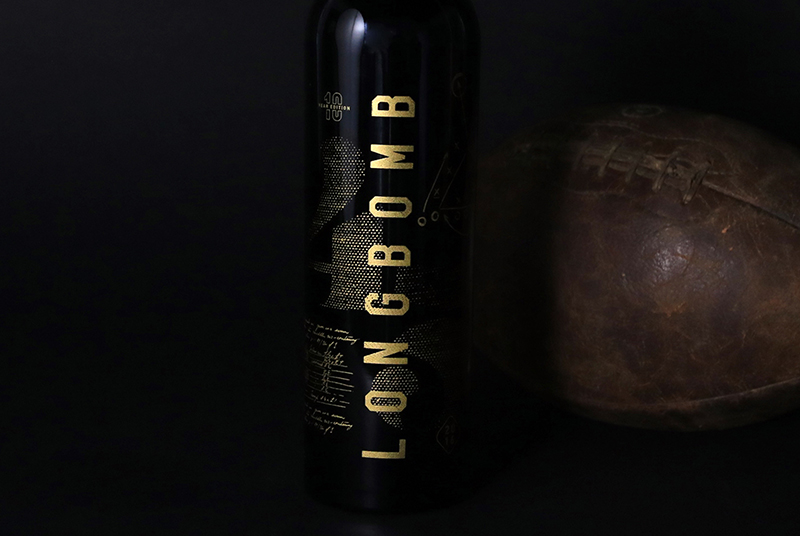
Longbomb by Tarara Winery
Package Design
As a commemorative wine for Tarara’s founder and Tarara’s 30th anniversary, Longbomb was redesigned tell his story and also be equal to the quality of the wine inside for this special release. The gold screen printing brings vintage sports details to life and exudes the premium nature of the wine inside. The package is thoroughly thought through, making the sides and back just as interesting as the front of package and finishing with a neck print instead of a capsule to set it apart.
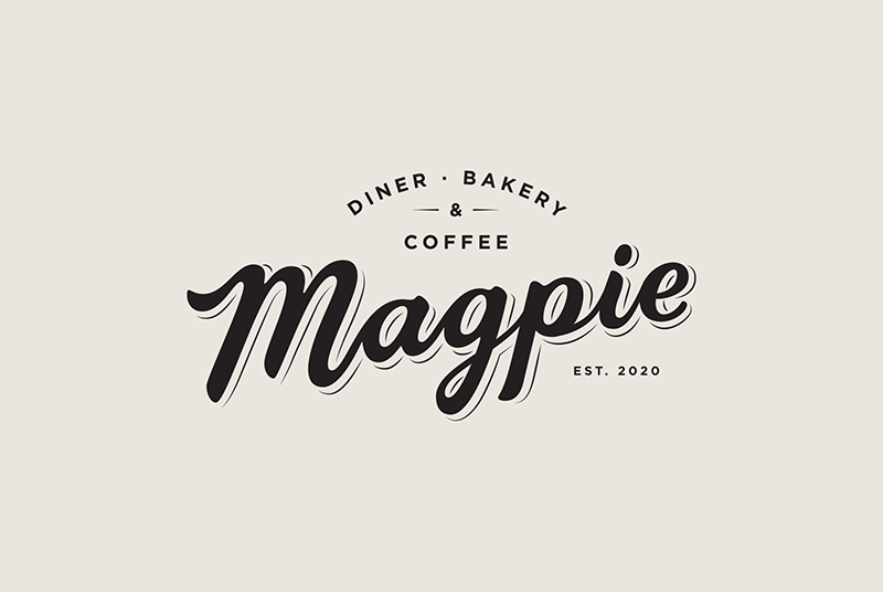
Magpie
Brand Identity/Logo Design
Founded by a visionary for creating amazing culinary experiences, Magpie promises to be a center of connection. The historic building is being renovated into a modern but comfortable space, housing a diner, co-working space, bakery and coffeehouse. Watermark designed the hand-lettered Magpie logo to reflect this desire to be a place welcoming to all, from the 6am construction worker, to the students of this university town to the start up entrepreneurs upstairs.
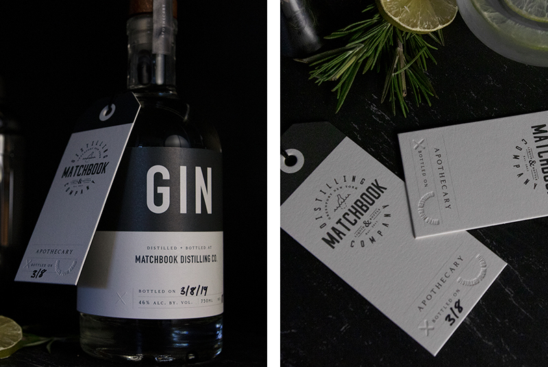
Matchbook Distilling
Package Design
Matchbook Distilling crafts custom bespoke spirits with their clients in their apothecary in Greenport, NY. These small-batch spirits need a flexible package that can be updated as they are created. The custom letterpress tags allow Matchbook to check off the botanicals selected by the client on the back, and the gin labels allow them to hand-mark the bottled date and batch numbers. The packaging allows the hand-crafted needs to marry with the brand identity in a seamless presentation.
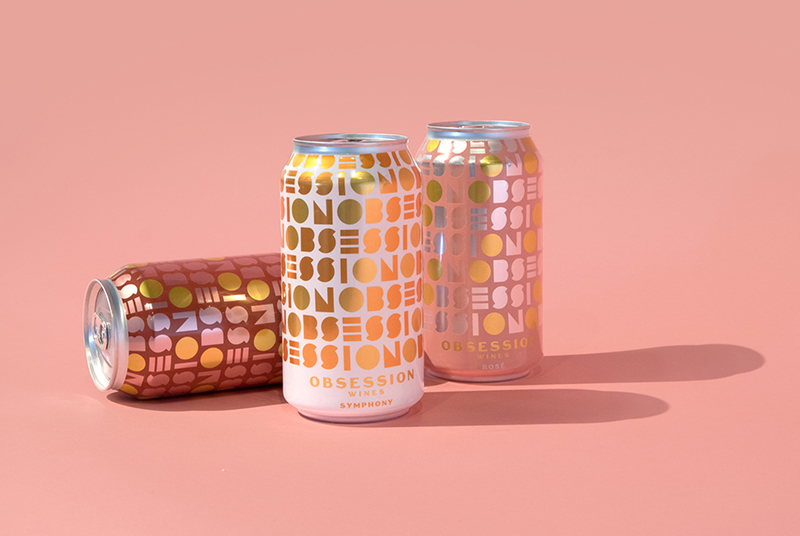
Obsession Wines
Rebrand & Package Design
Obsession wines, located in Lodi, California, approached Watermark looking to update their brand for a younger audience. We integrated an ode to the California sunshine into a unique typographic approach to create their new logo design. We then developed this into a pattern to create a canned wine design you can be #obsessed with. Obsession just medaled in the UK in Harper’s Wine & Spirit awards as well as the 2019 San Francisco International Wine Competition’s Label Design Competition!
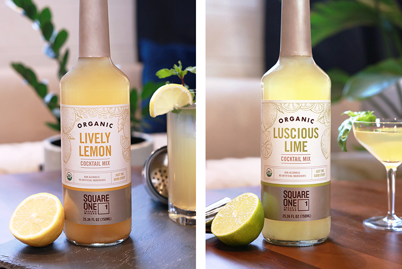
Square One Organic Spirits
Package Design for a New Product line
Founding the first female-owned Organic Spirits company in 2004, Square One is launching into new spaces again, with their line of Organic cocktail mixers. This new line integrated the acclaimed parent brand into lively, colorful packaging that boasts hand-illustrated botanicals, reflecting the real ingredients Square One promises.
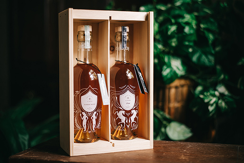
Castle Hill Cider
Package Design for a New line of Port Ciders
As new additions to the Castle Hill Cider portfolio, these cider ports & pommeaus (below) were elevated into screenprinted bottles. The pommeaus feature a logo-shaped cut-out in the center of the design that allows you to peer through the liquid. The ports were designed with custom illustrations to visually tell the story of Castle Hill. Sunday Muse spotlights a past inhabitant, Amelie Louis Rives Troubetzkoy, and 1764 highlights the area’s equine history.
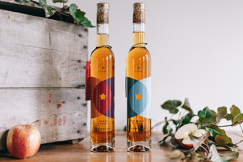
Castle Hill Cider
Pommeau Package Design
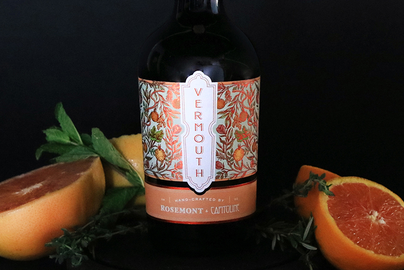
Rosemont of Virginia & Capitoline Collab Vermouth
Package Design
This package design is the amalgamation of two brands, combining into an amazing vermouth. Illustrations done by hand and enhanced with burnt orange foil detailing harken to the Capitoline brand while more formal typography and frames reference Rosemont of Virginia. Together, they form a spirited design that stands apart on-shelf.