What is a Brand Refresh?
Branding. The ‘it’ word of today. Branding means creating a cohesive message and experience across your brand, no matter where the customer meets your company. From your visual brand identity (think ‘logo’) to your website, social media, print and advertising, merchandise and signage, it should all deliver a consistent experience.
Watermark can start with a brand at any point. We can start from scratch or we can start in the middle, where a business already has an identity but no marketing collateral. Or, many times, we partner with businesses that have been in existence for 20 years, and have brand equity. In many of these cases, you do not want to throw the baby out with the bathwater, because you need to respect their history and their patrons. Just because you start a new relationship with a branding studio doesn’t mean you have to start from scratch. Where to start should be decided after an evaluation of your current brand within your market. In some cases, it is justified to start over, but if someone wants to start over without solid reasoning, run.
At Watermark, we tend to build the brand on the foundation of a strong visual identity (logo design, color palettes, font choices, etc.). Choices made in this process will affect the design of every piece of marketing collateral to follow. We center the brand on the logo because this is the one piece of the brand that will remain steady as your business grows and flexes, affecting your message, online presence, and everywhere else in the market that your brand exists. Therefore, the first question we ask is whether the foundation of your brand is a good one. Below, you will see examples where we have started over (rebrand), and others where we have leveraged the existing logo and instead updated the surrounding brand to bring it up to date or in-line with other objectives (refresh).
![]()
A brand refresh maintains the essence of the brand either through fonts, color, logo or other recognizable elements, but updates the design to something new and fresh.
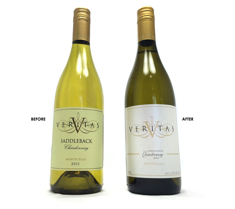
VERITAS VINEYARDS & WINERY:
Veritas is one of the original Virginia wineries, and so with their history came brand equity. After auditing the entire line of varietals, we brought the brand together through a refresh, maintaining the feel of the brand, but bringing consistency and elevating the brand through small improvements. Modifications included standardizing the stock selection to single stock/paper, and logo implementation by bringing the name VERITAS forward in more prominent coloring while the rest of the logo dropped back with consistent placement. Click here to see Veritas’ full brand to date.
BLUE MOUNTAIN BREWERY:
Over the years we have worked with Blue Mountain Brewery, we have refreshed not only the logo, but the labels, packaging, website and all marketing collateral as well. Below is the logo we were originally provided and the refresh we implemented in 2014, going for a bigger and bolder presence on-shelf. Click here to view the full Blue Mountain Brewery Brand.
![]()
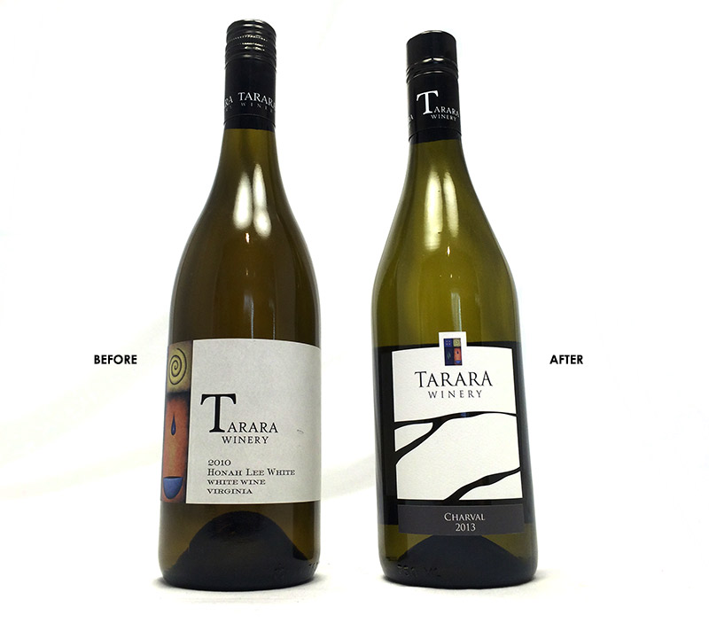
TARARA WINERY:
Tarara’s label refresh included graphic elements we were asked to retain, including the painting seen on the label. While designing a modern label representative of the waters flowing in front of the winery, we also integrated the painting into a custom-die area at the top of the label, which also integrated it into the logo design. Click here to see the full brand to date.
![]()
A full rebrand might include starting from scratch, including the logo, fonts, colors and more.
THE BARBEQUE EXCHANGE:
This BBQ mecca has been featured on the FOOD channel, and is locally beloved. In 2015 we were offered the opportunity to reimagine their brand. The X not only represents the literal railroad crossing at their location, but we also shortened the name to represent what people actually call them. We are also able to remove the X and repurpose it for their event and catering business, creating brand consistency across all of their endeavors.
![]()
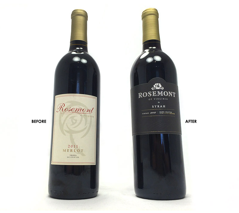
ROSEMONT WINERY
After evaluating Rosemont’s market presence and where they wanted to take the brand, it was decided that a full rebrand was a possibility to explore. In the end, the redesign made client and distributor alike, happy. The rebrand reflects the quality of the wine in the bottle and matches the price point as well. Consumer perspective is half the battle on shelf, and this rebrand opened doors to wider distribution. Click here to see the full brand to date.
Contact us to find out where your brand stands.