6 Things Design Can Do For Your Wine
At the recent Wines and Vines Packaging conference in Yountville, CA we sat in on a Nielsen presentation titled “A Common-Sense Guide to Winning with Bottle Design”. While there were many excellent topics discussed, we would like to focus on the portion that listed the ‘6 Things Good Design can do for Wine’ and break down exactly how design can influence your sales.
For those of you who do not know, Nielsen meticulously researches and measures consumer habits to understand what they are watching and buying. They study consumers in more than 100 countries to give you the most complete view of trends and habits worldwide.
Using eye tracking research, Nielsen has concluded that the longer a consumer’s eye stays on a wine, the higher chance there is that they purchase that wine.
Let’s dive in.
1. Get Noticed
It’s in your interest to be a contrarian to the bottles around you. Within the first few seconds, a consumer decides whether they think you are different from your competitors or not. How can the design of your packaging help your wine get noticed? Here are a few examples:
Die shape – The overall shape of your wine label. A custom die can be under sized, over sized, have custom edging, or moments that break the plane of the edge of the label.
Contrast – Contrast can be achieved by choosing a label color that is starkly different than the bottle color (when the wine is inside). The capsule or closure can also provide a nice pop of contrast.
Color – Choosing colors for your labels that are different from your competitors is an excellent way to get noticed on shelf.
Unique imagery – If your wine label features an illustration, consider the subject matter. Choose a unique or unexpected motif for your label.
Unique copywriting – Similar to the imagery, the copywriting can also jar the user into noticing your label. Consider naming your wine something fanciful. If the name is large and prominently placed on the label, the viewer’s eyes can’t help but read it.
Outer packaging – You can differentiate your wine with a unique outer packaging; whether it be a paper bottle wrap, a bag, or box.
Borrow a trend or style from another packaging category – For wine, we’ve found it very helpful to look at what type of packaging is selling well in beer, or spirits, or the health and wellness category. Since we work on brands in several different categories of packaging, we are constantly watching what goes on in neighboring categories.
Examples of Contrarian Packaging:
Jake Busching Wines is different because of the lack of text on the front of the wine label design.
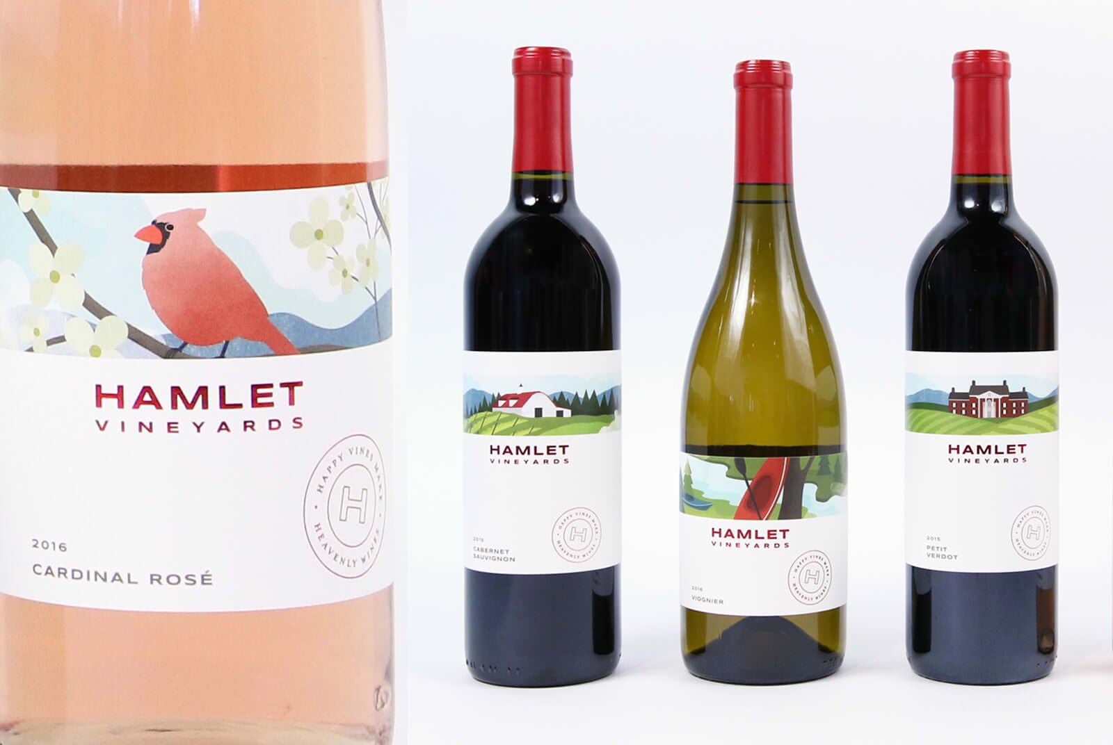
Hamlet Vineyards borrows from the beer industry for their packaging, featuring a separate unique illustration per varietal.
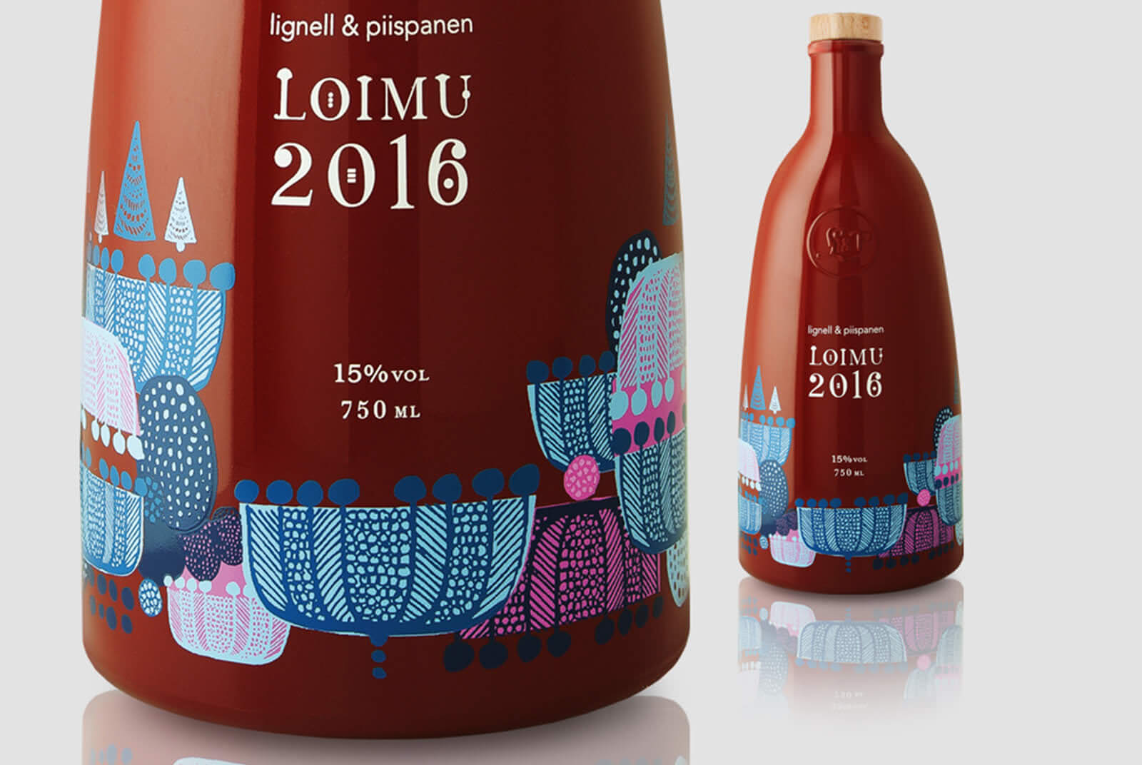
This glögi, or spiced wine, utilizes a unique bottle shape – One that not only reflects the unique product, but is sure to catch attention on shelf.
2. Hold Attention
Grabbing attention is great, but holding it is much more difficult. How to create an engaging label through design:
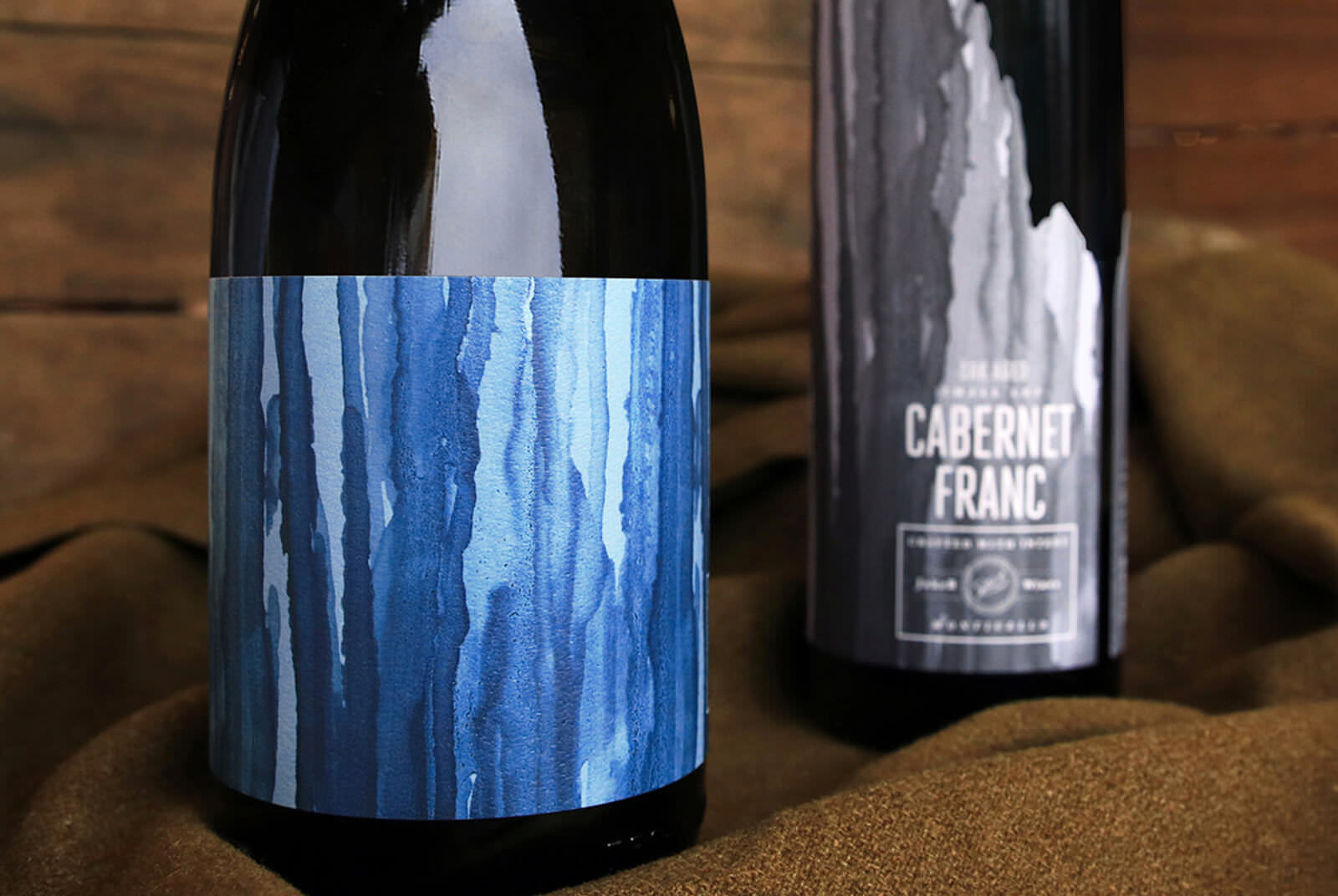
Imagery – Illustrations are quite prevalent in packaging, and for good reason. Whether it’s a pencil drawing, pen and ink, digital painting, or analog painting, Illustrations convey a mood and can often transport you to a new place. You can hold the viewers attention through imagery in a few different ways, with two being: 1.) Very detailed imagery that physically forces the user to look closer at the packaging to see what’s going on. 2.) Abstract imagery, if your marketplace is saturated with detailed imagery. Abstract artwork (think Picasso) can challenge the user and hold attention as the user is contemplating what the imagery means.
Typography and/or Lettering – The above principles apply to typography and lettering as well. You can have a very detailed intricate treatment of typography and you can also have typography that is abstract. Abstract type or lettering might be very subtle, barely there, running vertically, or running onto the sides and back of the label (which would force the user to pick up the bottle to finish reading).
Copywriting – As the consumer reads what’s on the front of your wine label, your chosen copy has an opportunity to really engage with them. You could put the brand story or the brand messaging on the front of the label and write it in a way that is thoughtful and unique. Creating fanciful names for your wine is another way to get creative with your copy and is completely in compliance with TTB as long as the proper varietal is listed elsewhere on the packaging.
Visual Texture – Whether it’s a gritty highly saturated texture featured on a label or a very subtle but detailed blind emboss, adding texture to your label in some way can help to invite consumer engagement.
Examples of Engaging Packaging:
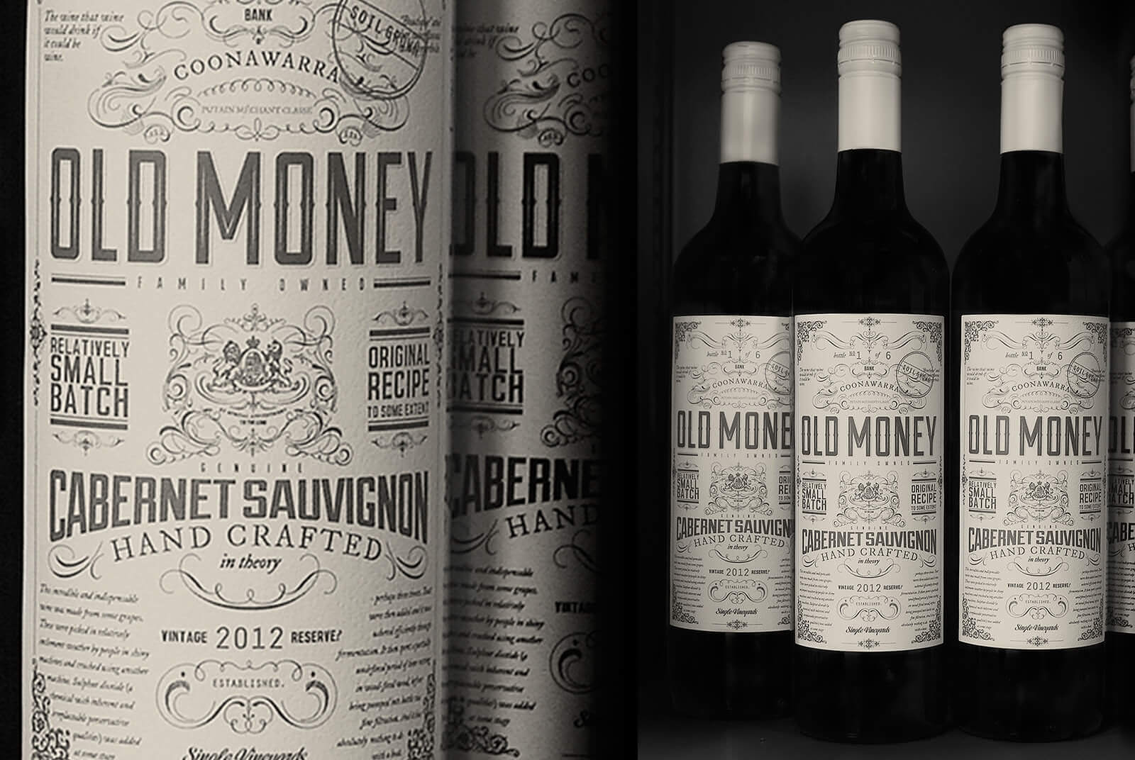
Old Money created engaging copywriting for the front of their label design, poking fun at themselves with terms like “soil-grown”.
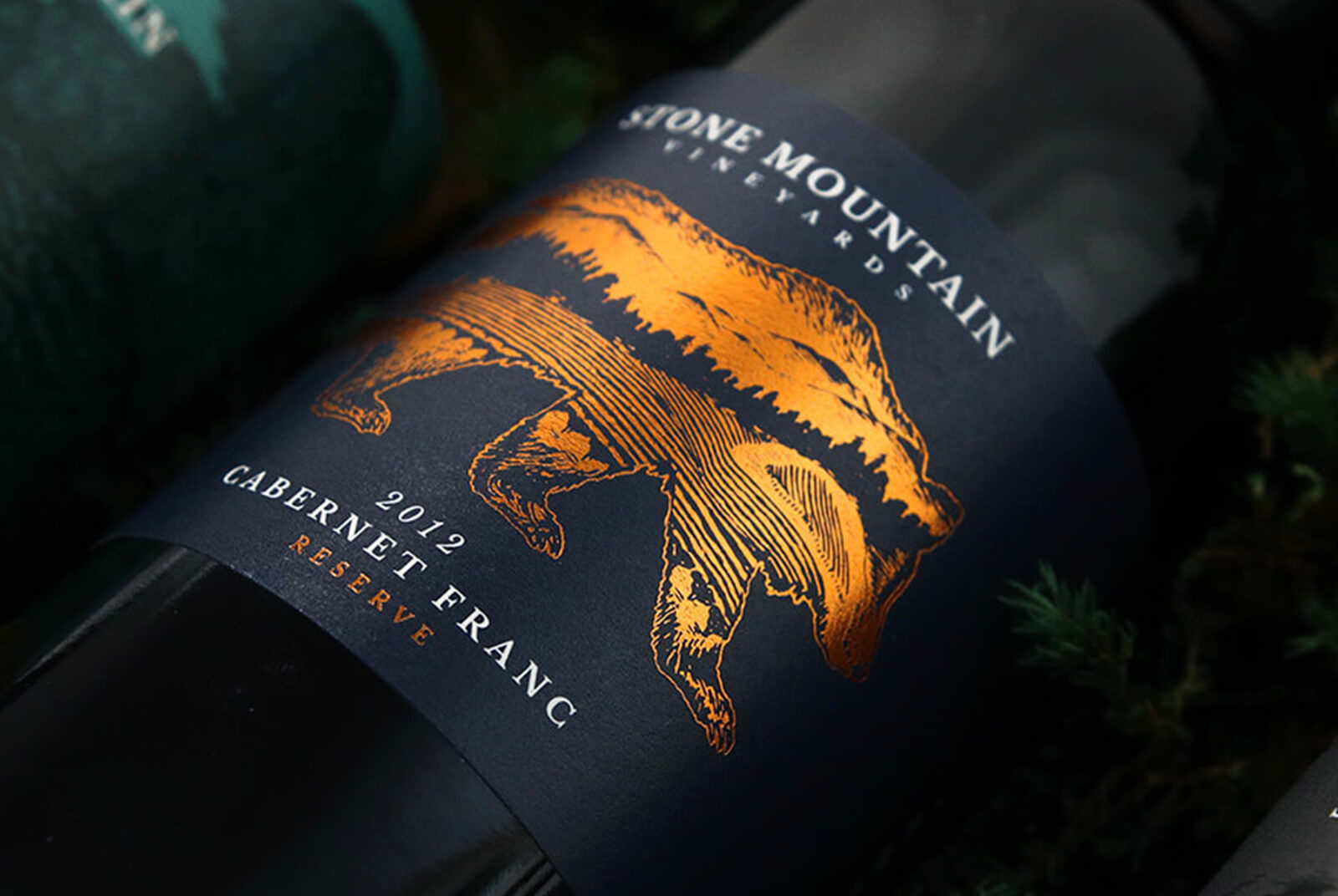
The reserve tier for Stone Mountain Vineyards features a detailed and engaging illustration of a bear double exposed with the vineyard view.
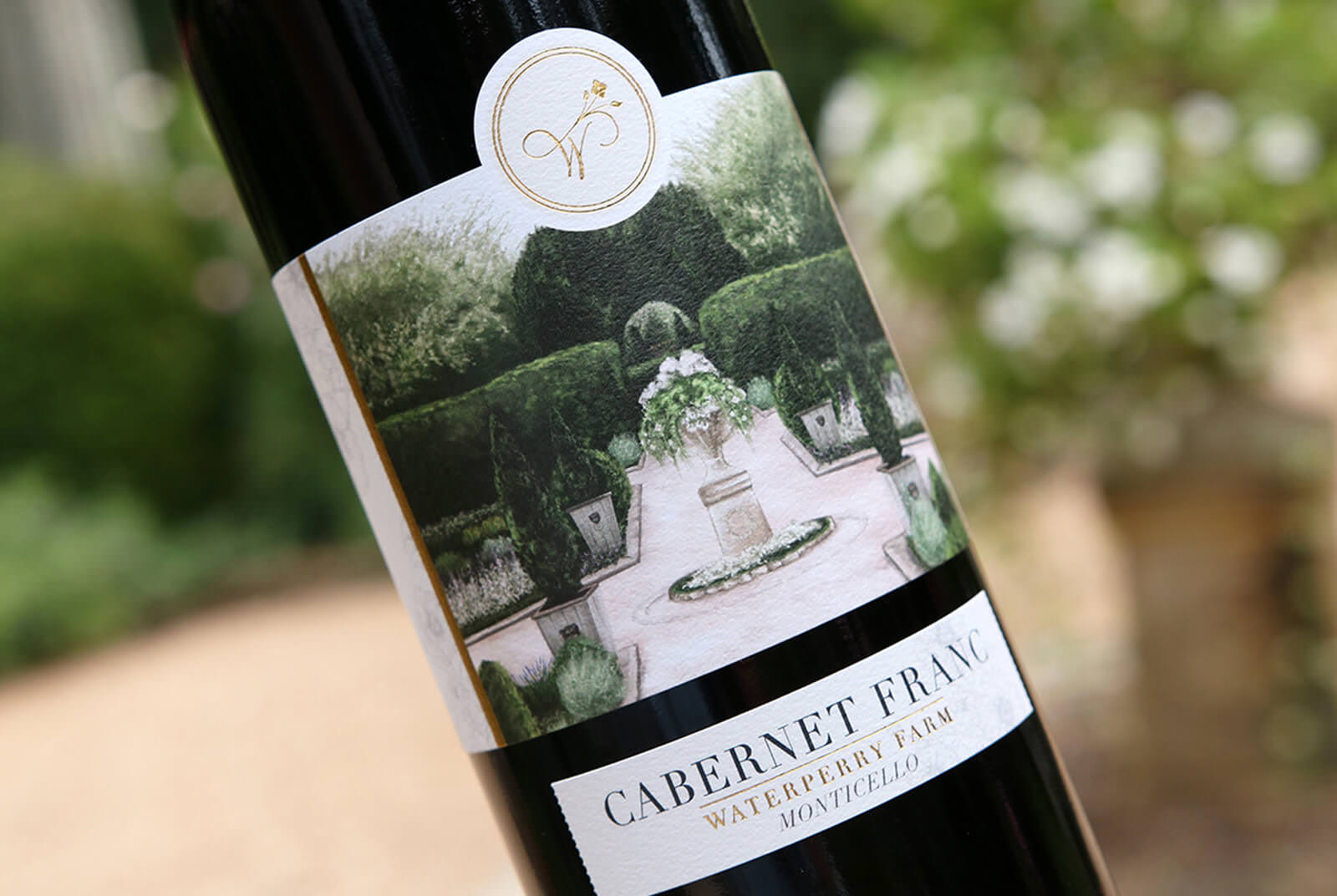
The gardens at Waterperry Farm were digitally painted and featured on the wine label to transport the viewer to the lush property.
3. Create Distinction
Compared to your competitors, where do you fall along the ‘approachable to premium’ scale and how can design convey that distinction on shelf?
Printing Processes – There are a myriad of ways to print a label today. The more dimensional your label is, the more opportunity there is to create distinction. When we say ‘dimensional’ we mean the actual physicality of the label – How the label feels and how the label appears to feel before you pick it up. Some ways you can create contrast and dimensionality are by using printing processes such as hot foils, cold foils, spot varnishes, embosses, thermography, etching, letterpress, and screen printing. Each of these processes can convey a different mood and tone. For example, gold foil often conveys a more premium brand thanks to the common history consumers have about actual gold. Making a hot pink foil look premium is a bit harder to do (though we are quite determined to do it).
“There are a myriad of ways to print a label today. The more dimensional your label is, the higher chance there is to create distinction.”
Paper stock – The paper stock chosen also has the power to create distinction. Typically a brand that uses a more matte paper would be considered more premium and artisanal. A brand that uses a glossy paper stock would be considered more commercial and approachable. Thankfully, there are more than just two types of paper to choose from and the plethora of paper options ensure that there is one out there that fits your brand and your goals perfectly.
The other option is to go paper-less. Your bottle can be etched, engraved, or screen printed on. Since these printing processes are typically more expensive than a paper label and therefore more rare, the lack of the paper label would indicate to the consumer that a brand is more premium or upscale.
Additional Packaging Elements – These would include neck labels, custom capsules or closures, wax seals, or an engraved moment on the bottle. Because they are rare, the more packaging elements that are shown the more premium the product.
Color – The color of your label or bottle can communicate how premium or approachable you are compared to your competitors. Color theory states that a bright yellow (think Yellow Tail) would place that brand within the accessible more approachable tier of wine. On the other end of the spectrum, an all black label with moments of gold foil has historically meant a more premium sophisticated product. Culturally, consumers know this, whether they are aware of it or not.
Typography – In a very general sense, a Serif typeface would indicate a more traditional, classic and premium product, while a Sans-Serif would indicate a modern, approachable product. However, there are more than just two categories of typefaces and when you include the range of styles hand lettering offers, you quickly conclude that the most powerful way to create distinction with typography is all about how well a typeface or piece of lettering is created and how the designer applies it.
Examples of Distinct Packaging:
Afton Mountain Vineyards uses a premium printing process to create distinction: screen printing.
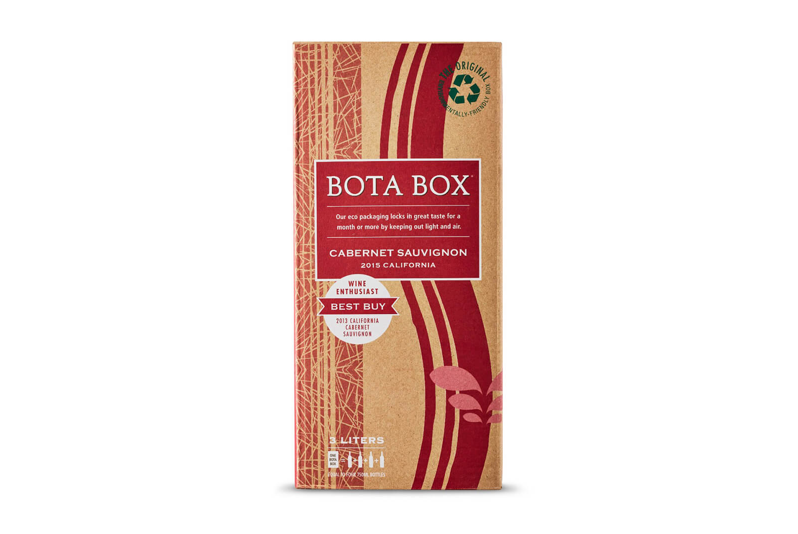
Bota Box uses a unique outer container, the recyclable stamp and color (kraft) to create distinct packaging for an eco-conscious brand.
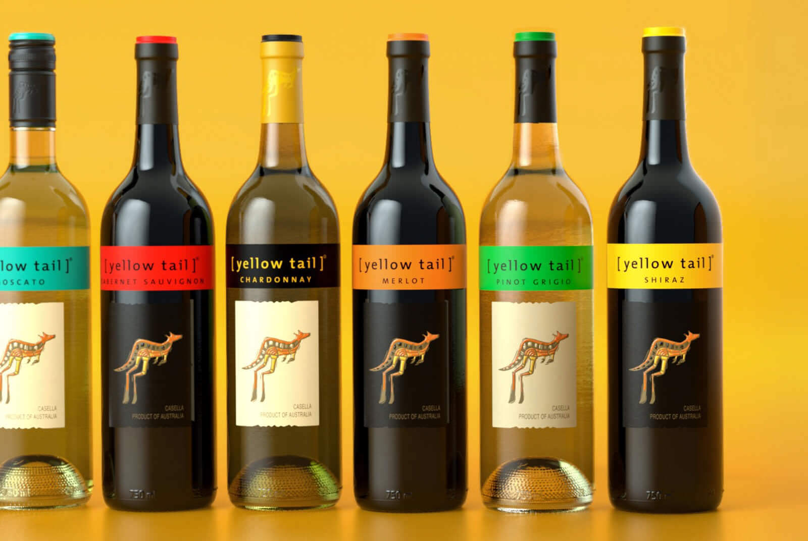
Yellow Tail uses pops of bright colors to illustrate the approachability of their brand.
4. Communicate Equities
What is your brand personality and what are your values? Though this is sometimes the most difficult thing to define, it is pertinent in your success. If you can communicate your unique story through your packaging you will create the contrast between yourself and your competitors. A brand is more than simply a logo. A brand is actually a feeling or mood. If you conclude that you want your brand to be ‘dark and mysterious’, it’s the designer’s job to communicate that mood through the brand visuals. So what elements of your wine packaging can communicate a feeling?
“A brand is more than simply a logo. A brand is actually a feeling or mood.”
Color – Color theory would say pastel pink would exude a female focused soft mood. Words like ‘Fun, sweet, feminine’ come to mind. Army green however, might convey a more masculine, serious, or earthy feeling. Words like ‘Brave, Traditional, Naturalistic’ come to mind.
Typography – When it comes to communicating feelings, typography can be very potent. If ‘Minimal’ is one of the primary words you would use to describe your brand, then a designer most likely would guide you towards using a modern sans serif typeface. If your brand is rooted in history and heritage a designer could use either a serif typeface or create a piece of lettering that directly relates to the typography from that time in history.
Imagery – We are all familiar with the French wine labels that feature a Chateau on the front. This is cultural, and ingrained in the minds of the consumer as well. If your brand story is one of tradition, nobility, and/or history, then featuring an illustration of your Tasting Room or Chateau on your label is an excellent way to convey your brand equities to the consumer. If your brand story is one of modernity, casual fun, spunk and/or punk then using Chateau imagery is not the correct route for you.
Copywriting – What you are saying on your label is an easy way to ensure the consumer understands your unique equities. Do you have a tagline? If so, you can feature that message on the front or back of the label.
Examples of Authentic Brands:
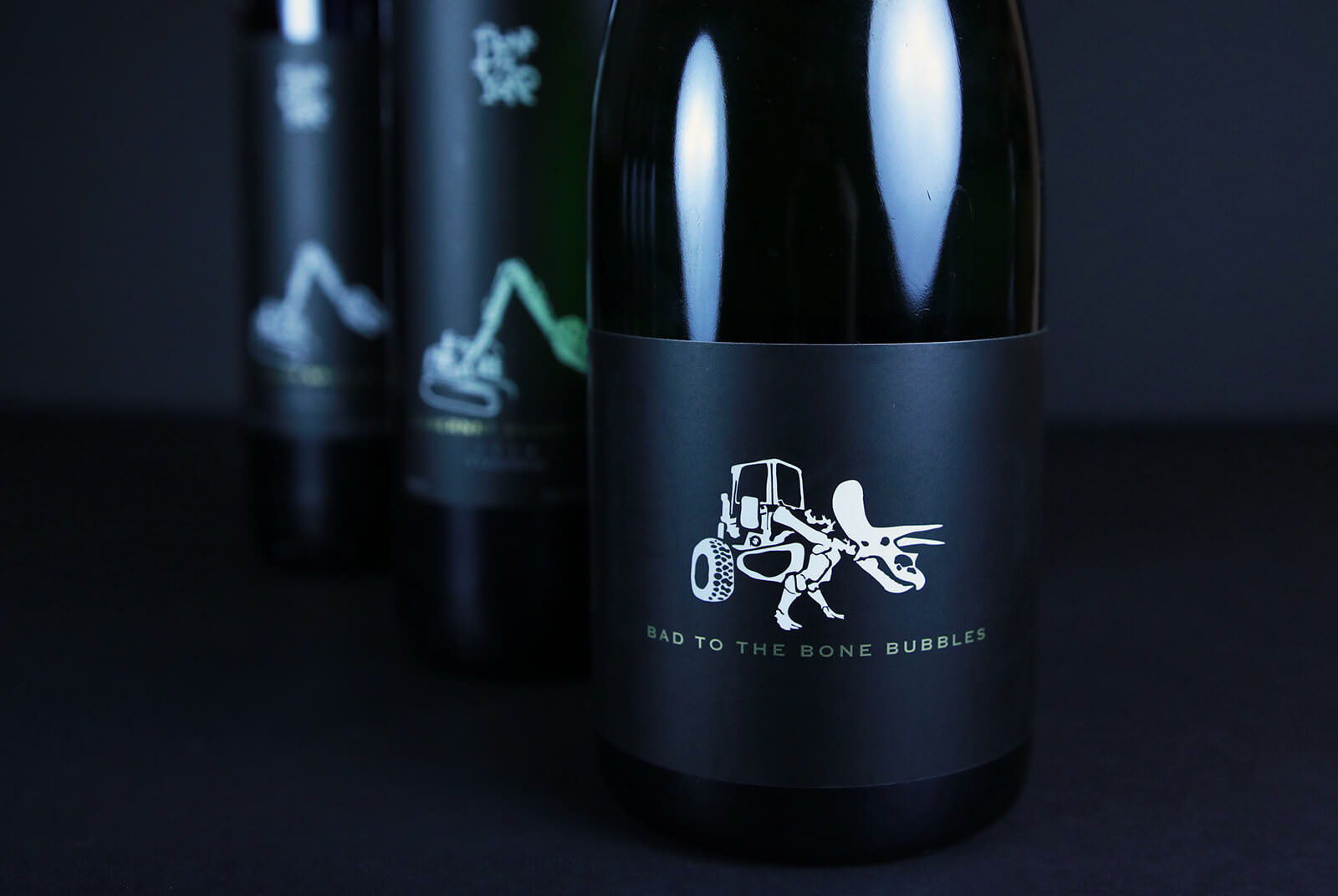
The Boneyard’s packaging features a unique illustration (dinosaur tractor) on each varietal and uses specific copyrighting (a fanciful name) to convey the brand’s approach: A playful, no-rules, head-first dive into winemaking.
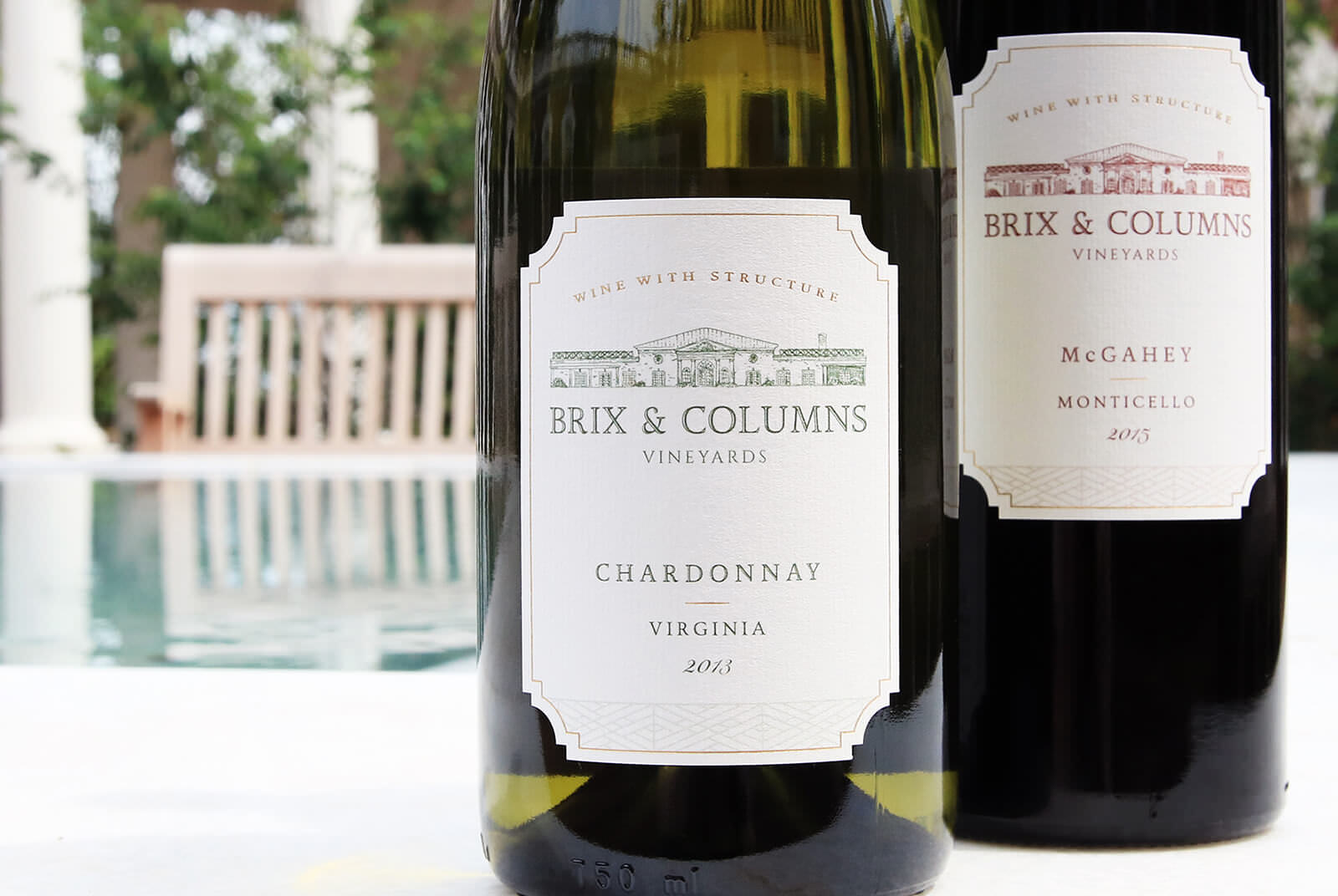
The packaging for Brix and Columns uses classic and traditional typefaces to exude their primary brand value: structure. They value structure both in their wine and in the architecture on the property.
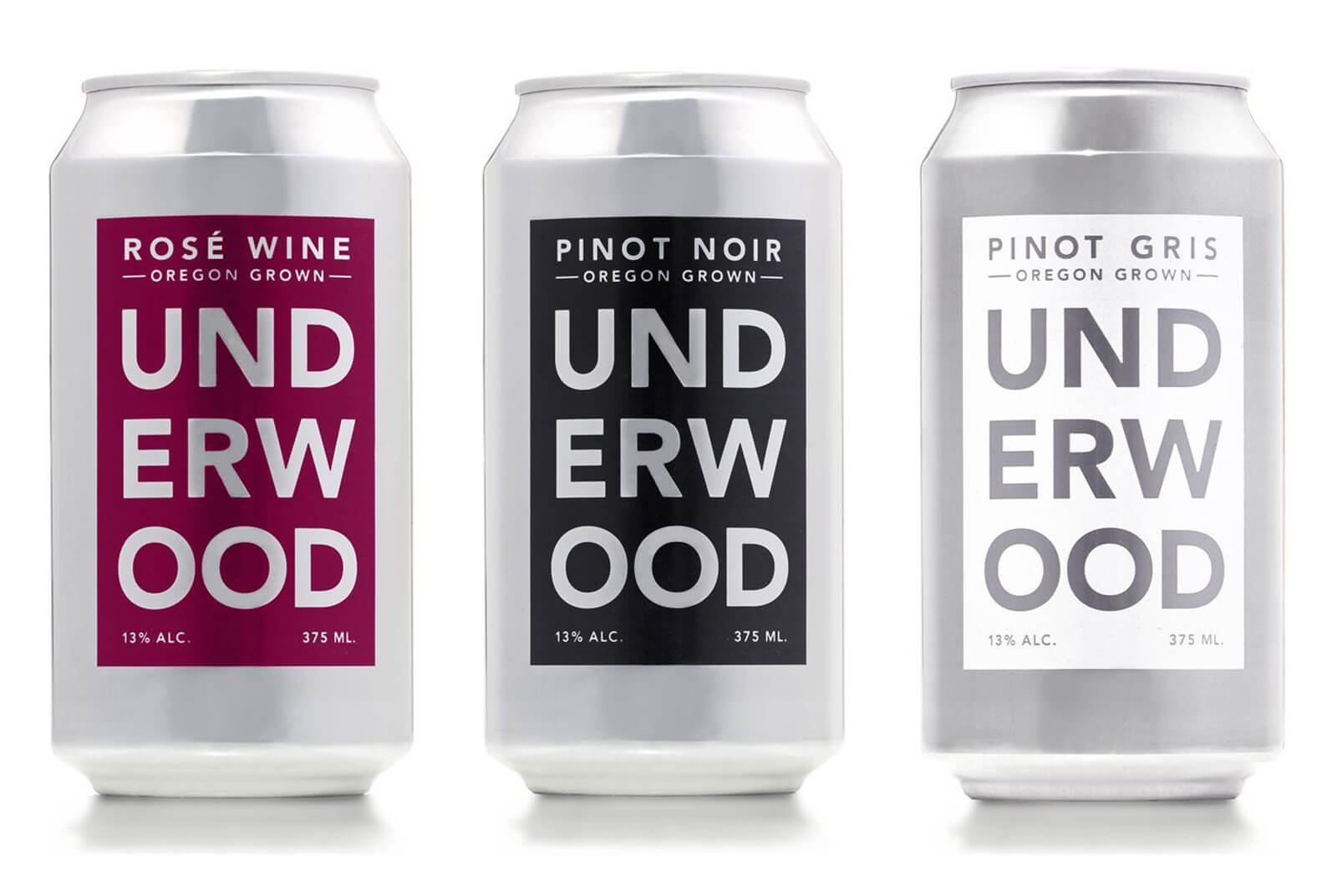
The Underwood Wine Cans use specific typography (a modern sans-serif), a limited color palette and outer packaging to convey their brand goal: Create a product that promotes approachability. They are seeking the audience that does not want too much fussiness while drinking wine.
5. Drive Positive Sentiment
A negative, positive or neutral sentiment generally means the attitude or opinion one expresses towards a specific subject or object. A positive sentiment causes positive emotions in the brain. When the consumer has more positive emotions about your wine packaging, they are more likely to purchase your wine. Positive sentiments would include words like ‘fun, hopeful’ and ‘brave’. Negative sentiments would include ‘imperfect, dreary, gross, creepy, offensive’ and ‘sad’. Neutral sentiments would include words like ‘simple, candid, clinical, serious’ and ‘staid’. Neutral sentiments are not necessarily hurting or helping your brand. So, how can design drive positive sentiments?
Featured Subject Matter – Consider Imagery. According to Neilsen, “consumers considered Mirassou’s design to be APPROACHABLE, BOLD and FUN (all positive sentiments) —with 88% of consumers responding positively to the upbeat sun emblem.” For each desired market, there is specific imagery that is embedded with positive sentiments. Once you know your target market, you can identify the images that would drive positive sentiments for those people.
Typography – Believe it or not, type can be warm and inviting. It can also be playful, sophisticated, and elegant. No matter whether your brand is more approachable or more premium, type can help to convey a positive sentiment to the consumer. A great example of this is the wildly popular Gotham. Because of how it was created, Gotham is ‘friendly but never folksy’ exuding positive sentiments such as warm and professional.
Copywriting – As mentioned in number 2, as long as you follow TTB’s regulations, you can create a fanciful name for your wine. Creating a fanciful name is a great opportunity to feature a word or phrase that will drive a positive sentiment.
Examples of Brands that drive Positive Sentiments:
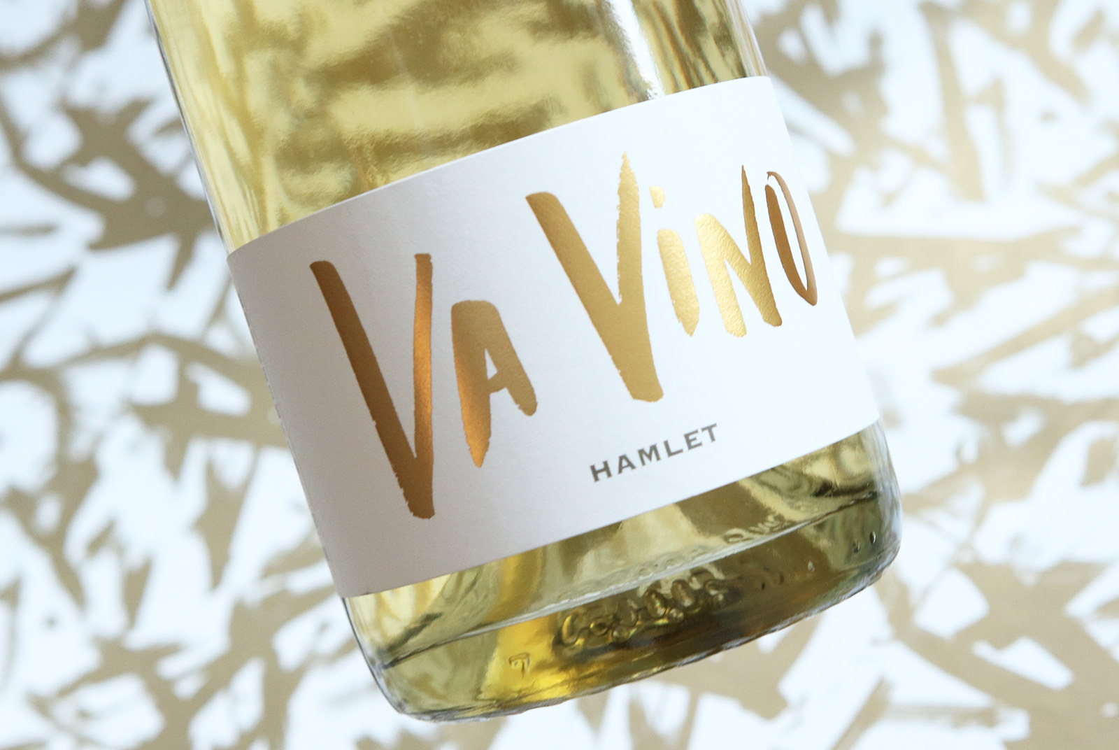
Hamlet Vineyard’s Sparkling Va Vino uses copywriting as their primary method of driving a positive sentiment – “Va Vino” rolls off the tongue and has a celebratory sound to it.
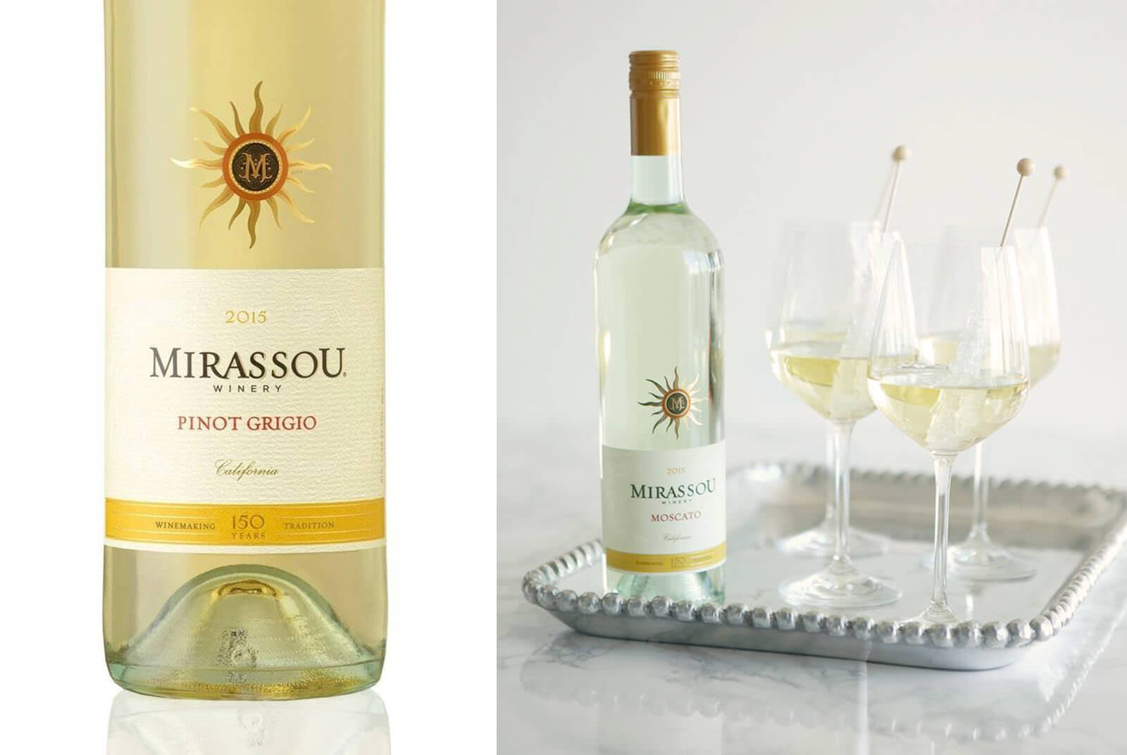
In a study conducted by Nielsen, “consumers considered Mirassou’s design to be APPROACHABLE, BOLD and FUN (all positive sentiments) —with 88% of consumers responding positively to the upbeat sun emblem.”
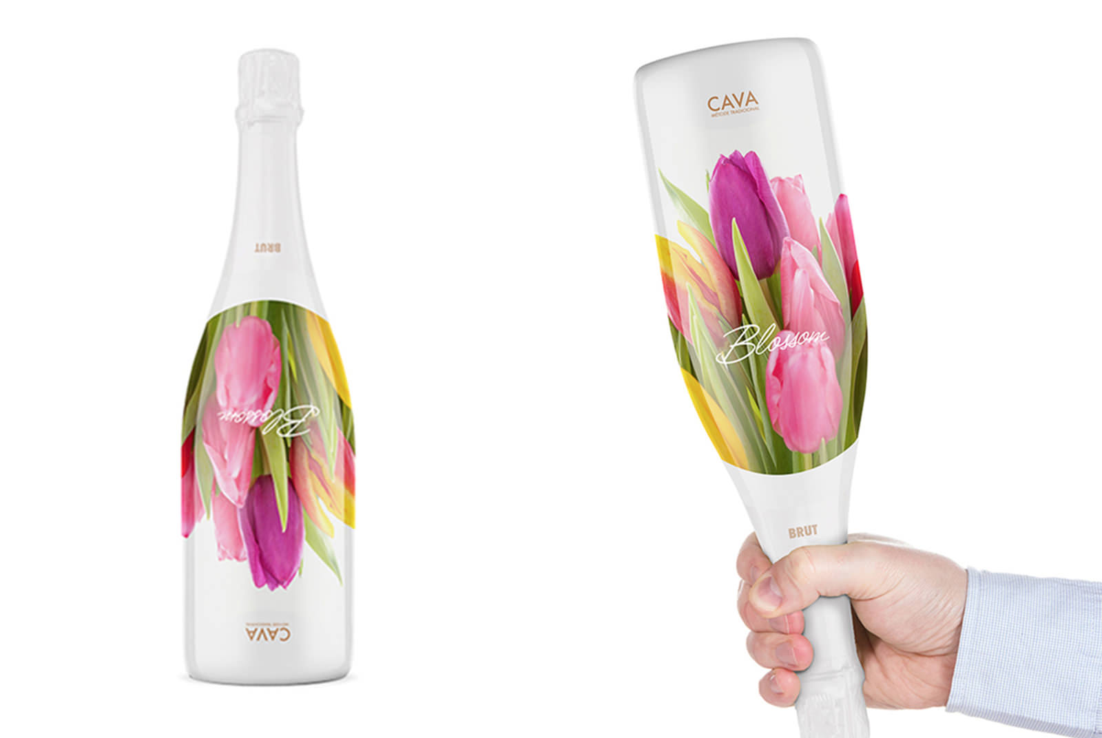
The Blossom Cava Sparkling Wine packaging exudes positive sentiments with the use of florals and the interactive element of asking the user to turn the bottle upside down.
6. Shift Preference
A packaging redesign can dramatically affect your sales. In a recent Nielsen survey a redesign increased preference for the brand by nearly 50% by retaining current buyers and attracting their competitors. Since the wine itself is not changing, if there’s ever a jump in sales after a redesign it is solely because:
Together, the designer and winery took numbers 1-5 on this list very seriously.
Examples of Successful Redesigns:
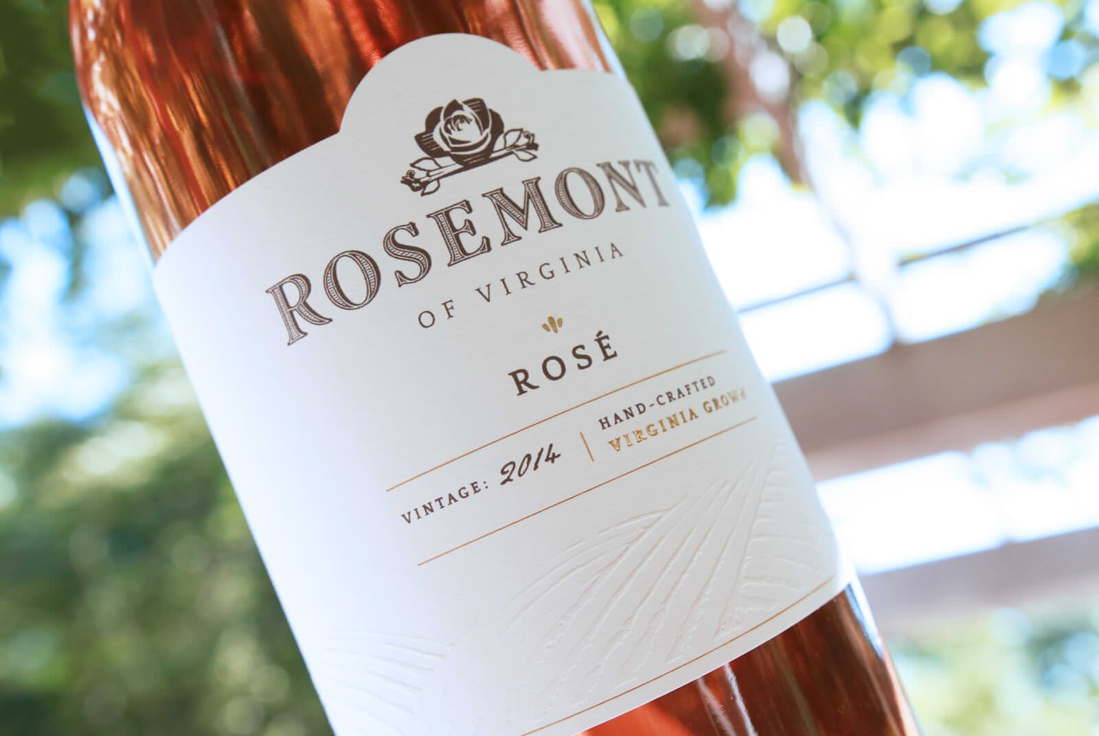
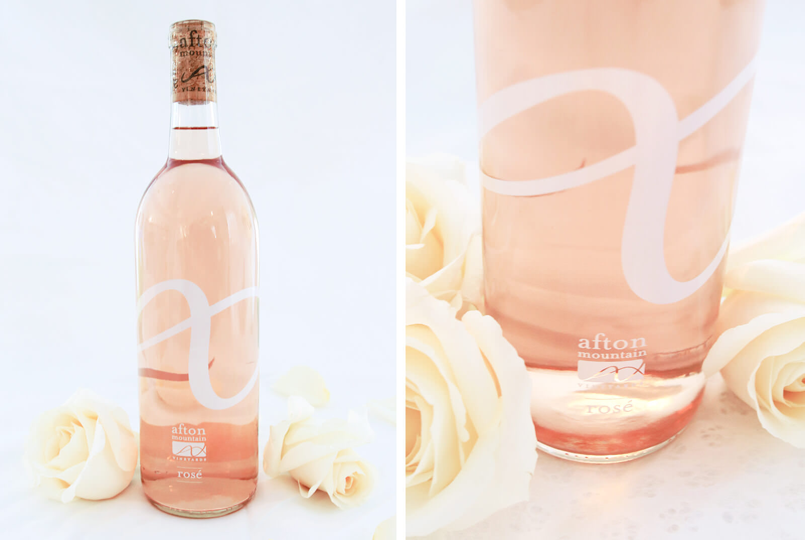
After a rebrand, Rosemont of Virginia’s Rosé increased in sales by 30%.
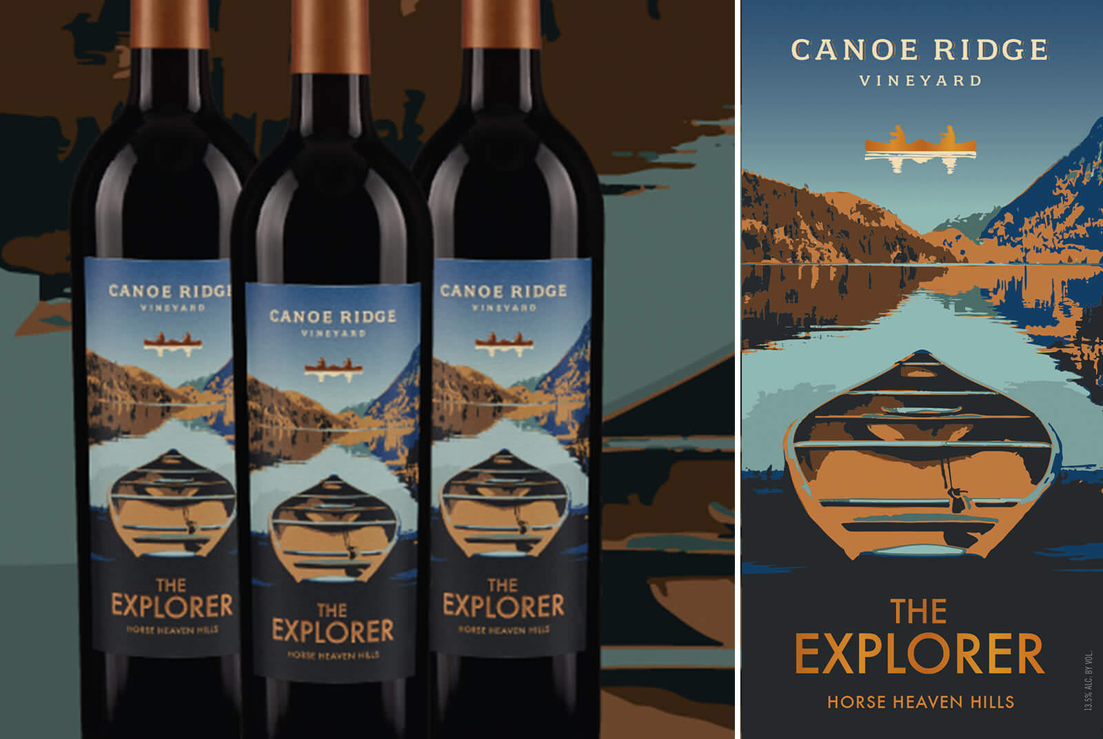
According to Nielsen “the Canoe Ridge Explorer label had +24% increase in people who preferred the redesign”.
According to Nielsen, “Package design reaches 100% of likely buyers at the first moment of truth where 50-80% of purchase decisions are made.” This means that at shelf, within those first few moments, package design influences 50-80% of purchases. The better your packaging is the better your sales will be. This will, in turn, make your retailers and distributers happier and more loyal to your brand. As a Design Studio we can honestly say that we want all of our clients to thrive.
Cheers to wine and design!